Story Travel Website Design
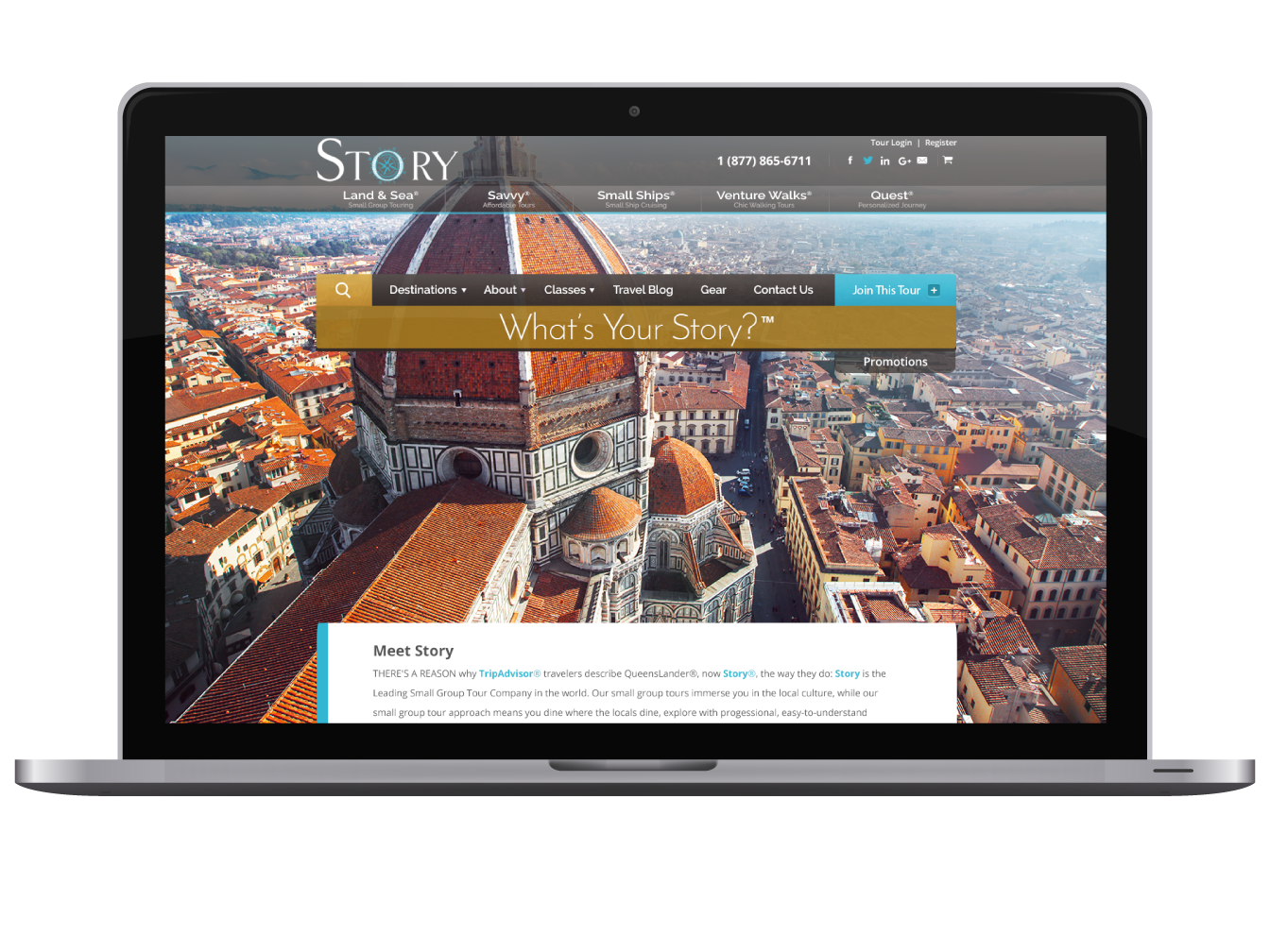
Story is a small group tour company founded in Centennial, CO.
Travel abroad is all about what you can see. Why not feature that in the website? Large, exciting local images of the travel destination greet clients on all the travel pages. Sleek animation and presentation draws users into the site. I designed and developed this entire site. Check it out.
Denver Website Design
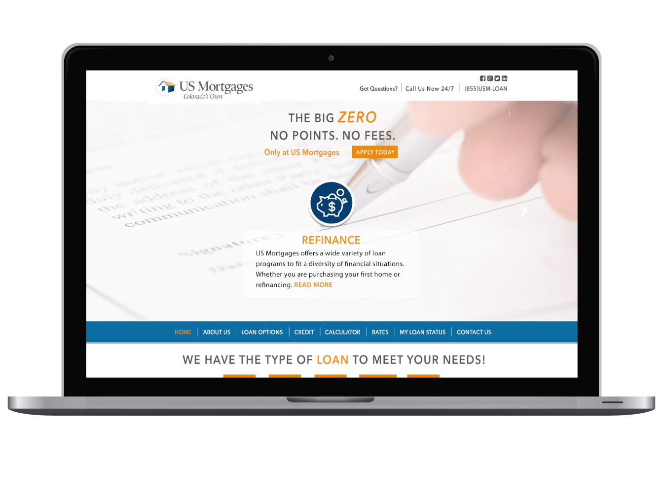
A minimalist website design for a mortgage company in Denver, CO. The site pulls in the latest rates from an API and pulls in different offers on the main slider. View the live page.
Work done while at Get Found Fast
Flight School Web Design
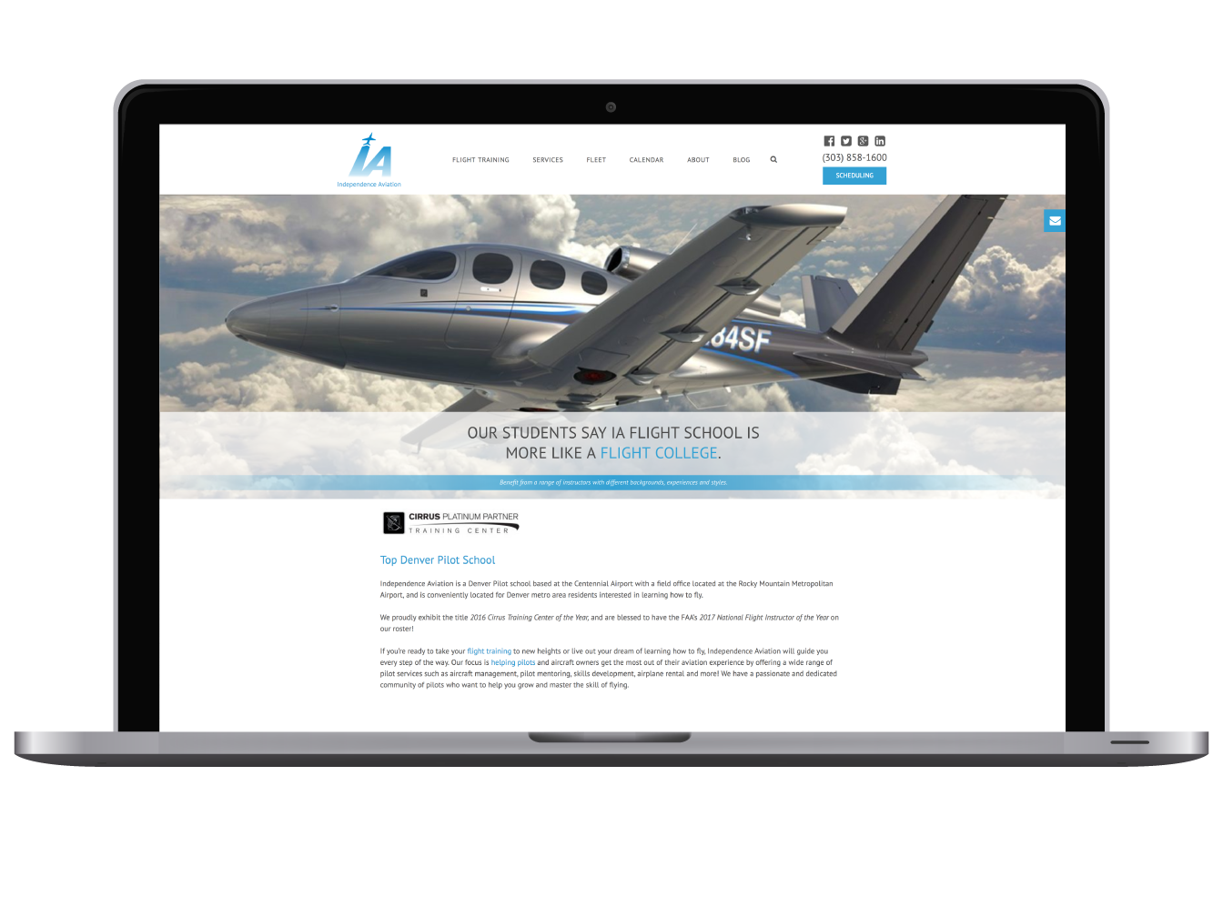
Independence Aviation site was designed and developed in Wordpress with the goal to entice people to want to fly. To do this large beautiful images of planes in flight were used in a slider that has a slight Ken Burns zoom effect to make it appear as if the plane was in motion. The pages were all optimised for SEO. View the live page.
Work done while at Get Found Fast
Three Fill Coffee Logo
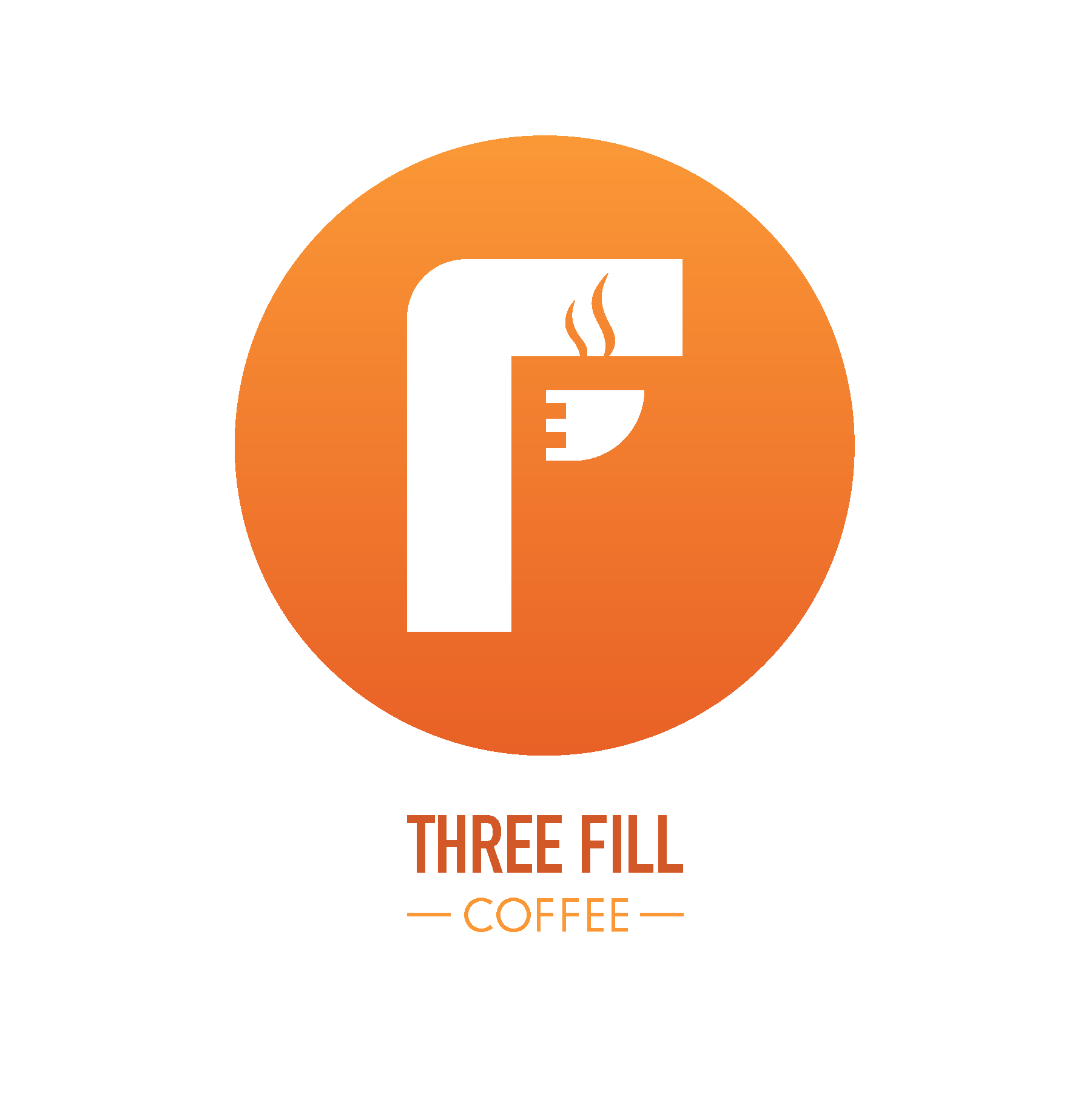
Three Fill is a handmade coffee company in Colorado Springs, CO. You can't just have one cup but three - it's that good.
The logo is an 'F' in the shape of an espresso machine and the coffee cup also represents the number 3.
Custom Logo Design
Startup Tech Company Logo Design
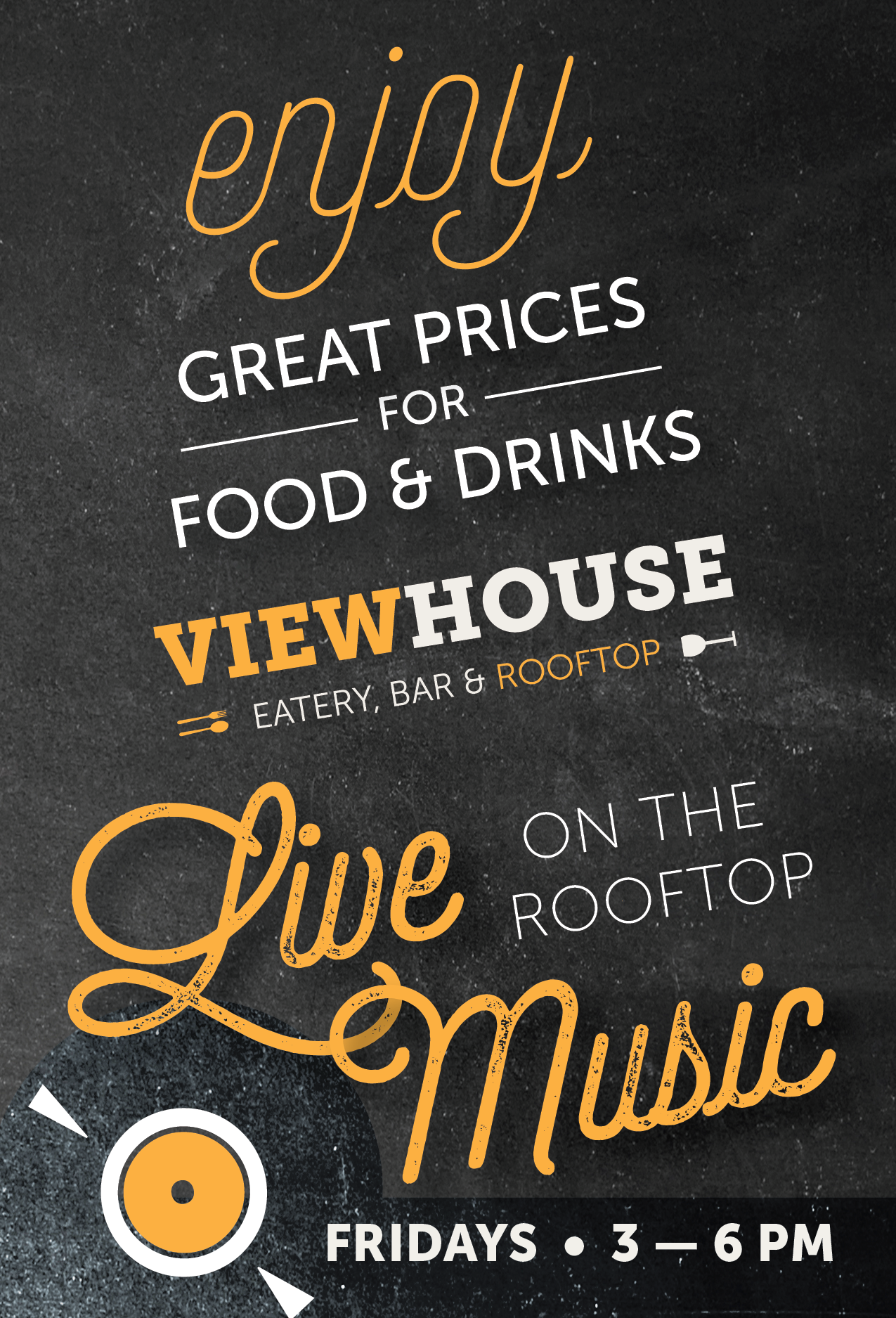
Restaurant Advertising Design
A table tent design for the Viewhouse restaurant in Denver, CO. Custom design is available for restaurants at reasonable rates. Contact me today
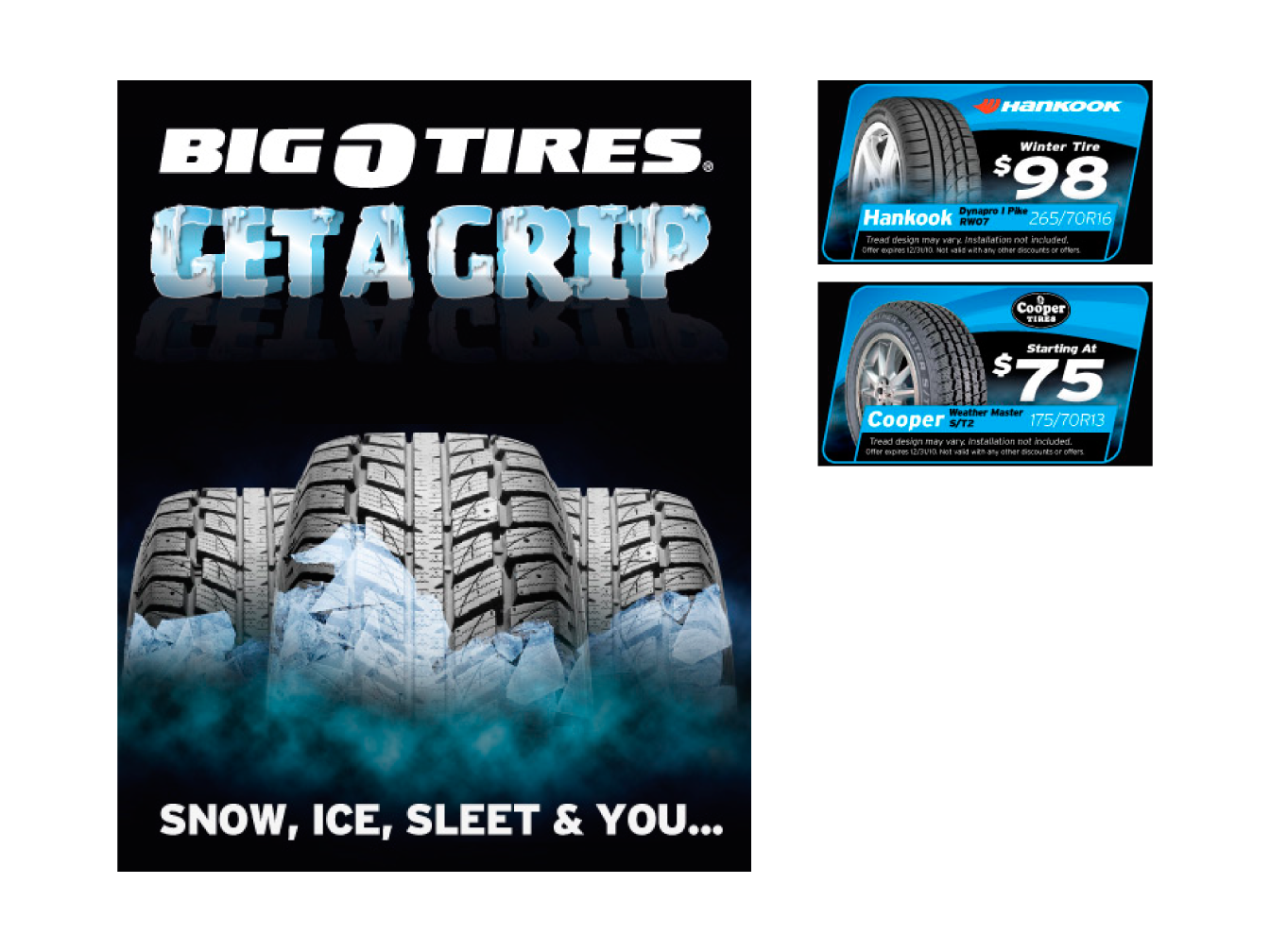
Big O Tires Coupon Design
A group of coupons for advertising in Denver, CO. Custom design is available for all types of businesses at reasonable rates. Contact me today
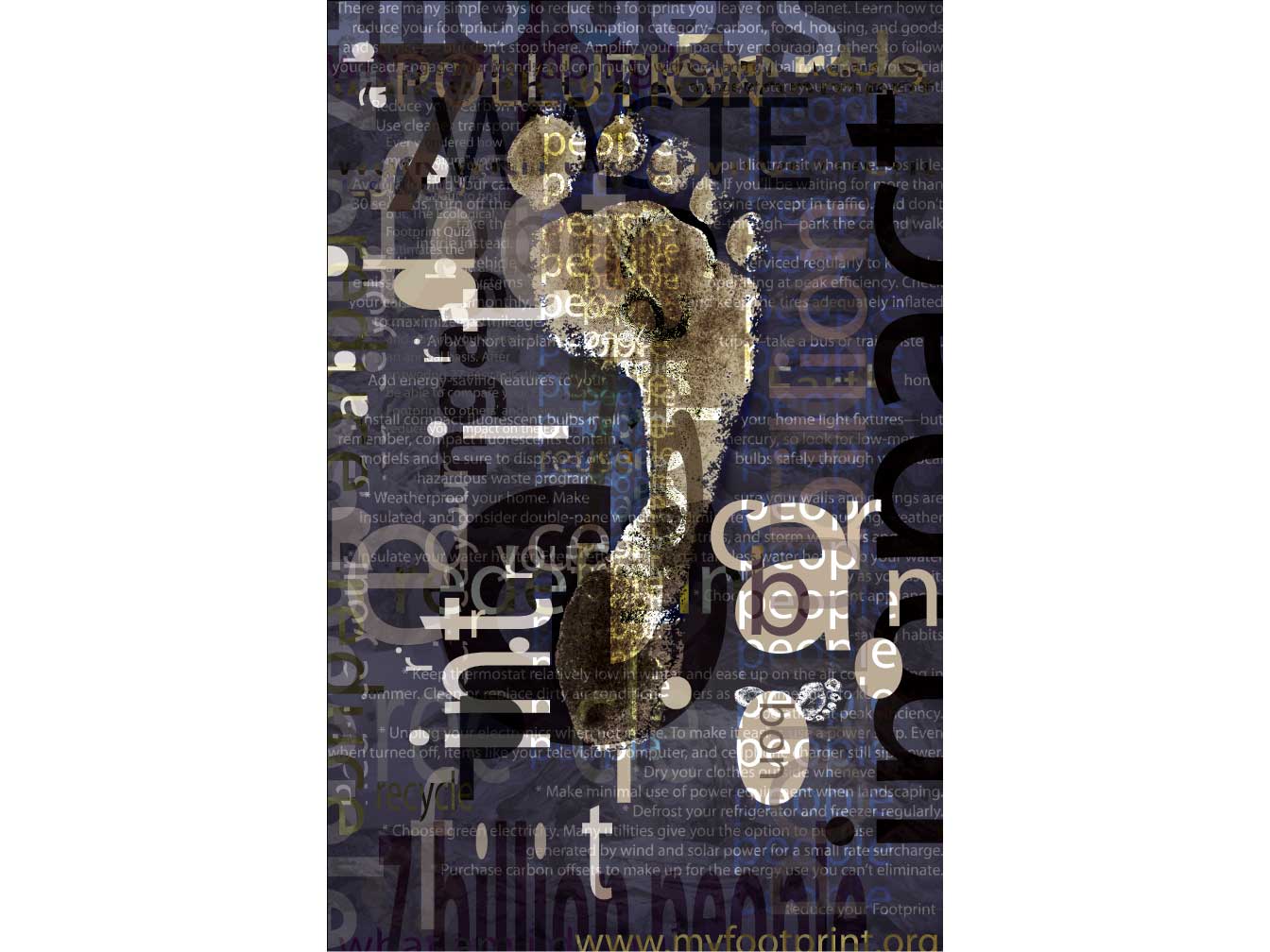
Award Winning Poster Design
Impact. That's what this large poster was designed to create. From a distance it is read as a giant foot and because it is made up tiny fragraments it beckons the viewer to move closer to seek out the details.
The Deconstructivist style - popularized by graphic designer, David Carson, was the perfect way to show the various ways we all contribute to the destruction of our world. The fragmentation of type, colors, and imagery represents each of the ways we consciously and unconsciously affect the environment around us.
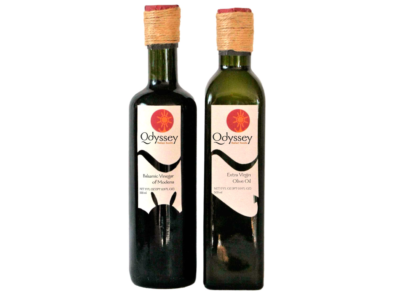
Odyssey Oil & Vinegar Packaging
2009 ADCD Award Winner
Selected in the 2009 Art Directors Club of Denver Student Show for best concept in packaging design.
Great taste is like a long journey at sea. The helm (steering wheel) and anchor are two vital elements of a ship. They also describe the great taste of Odyssey vinegar and olive oils. The helm steers you to rich balsamic vinegar flavor, while the anchor holds the rich tastes of pure extra virgin olive oil. Each bottle takes you on a journey of discovery bringing out the rich flavors in your food.
The bottom of the labels are cut out to reveal a helm on the vinegar bottle and an anchor on the olive oil bottle. The wave shape above echoes the ship theme. The Odyssey logo, at the top, combines an anchor and helm. The rope-like bottle cap completes the overall ship theme.
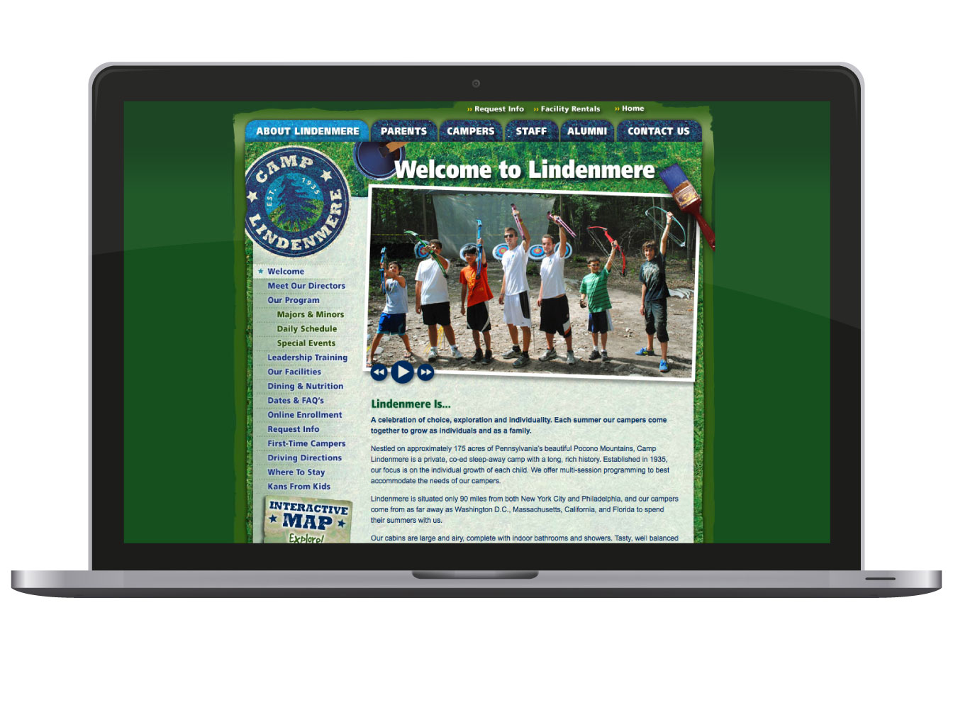
Summer Camp Web Development
I designed and developed the secondary pages for this summer camp and optimized the slideshow images. View the live site.
Work done while at Creative Navigation
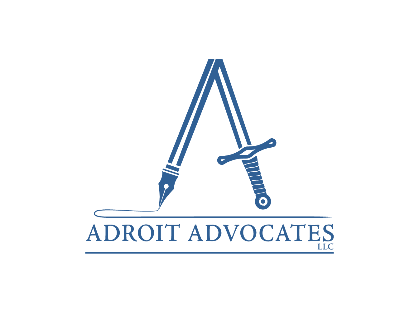
Lawyer Logo Design
Logo Design and Branding
The word adroit means clever or skillful in the use of hands or mind. In this branding of a Denver, Colorado lawyer office, I chose to emphasize the skillful use of both mind and hands with a sword that transitioned into a pen. This idea also rings true of the pen is mightier than the sword. Finally the letter 'A' was disguised within the sword and pen to further emphasize the name Adroit Advocates.
NIFA Logo Design
Logo Design and Branding
NIFA's previous logo was dated and difficult to use with the rounded border surrounding the type. This new minimal logo design launches the organization forward with an emphasis on healthcare. The letter "N" is prominently featured within the most recognized symbol of healthcare, the cross. Finally, the blue color was slightly adjusted and given an accent blue color to make this logo pop.
Type Animation Video
This award winning typographic animation is based upon the book Love You Forever by Robert Munsch and animated to the song When You Come Back Down by Nickel Creek.
The story features the letter 'U' which personifies the mother and the letter 'o' which represents her son. It is a story of growing up and life.
Brand Identity Design
Logo Design
This logo mark features a single feather from a blue bird. The logo is used by a fine artist studio in Loveland, Colorado and designates her work for Artspace Projects. Artspace is the leading developer of arts facilities - creating, owning, and operating affordable spaces for artists and small businesses.
Card Game Logo Design
Logo Design and Branding
Brangle™ is a game of quick wit. The branding had to reflect this fast game play of word recall. The brain is featured in this logo among with symbols representing different areas of recall.
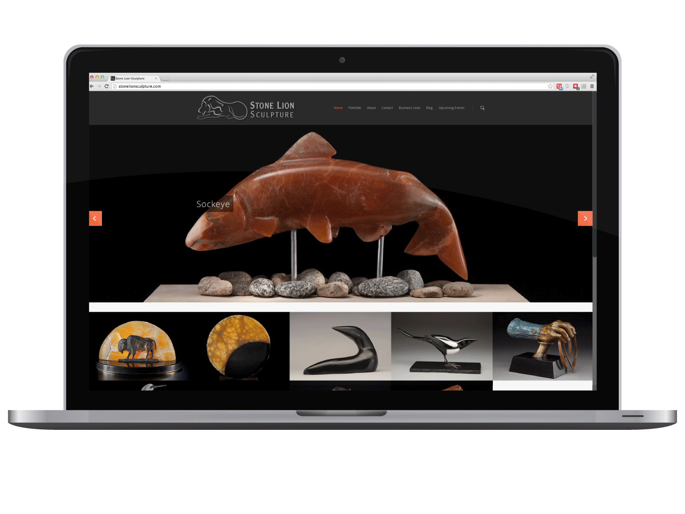
Custom Wordpress Web Development
I designed and developed this website for a local stone sculptor in Loveland, Colorado. The client wanted to feature his work prominently and showcase the beauty of his stone sculptures.
I developed this site on the Wordpress CMS system to make future updates easy for the client to make. I can design and edit existing Wordpress templates. I develop in HTML, CSS and PHP. View the live site.
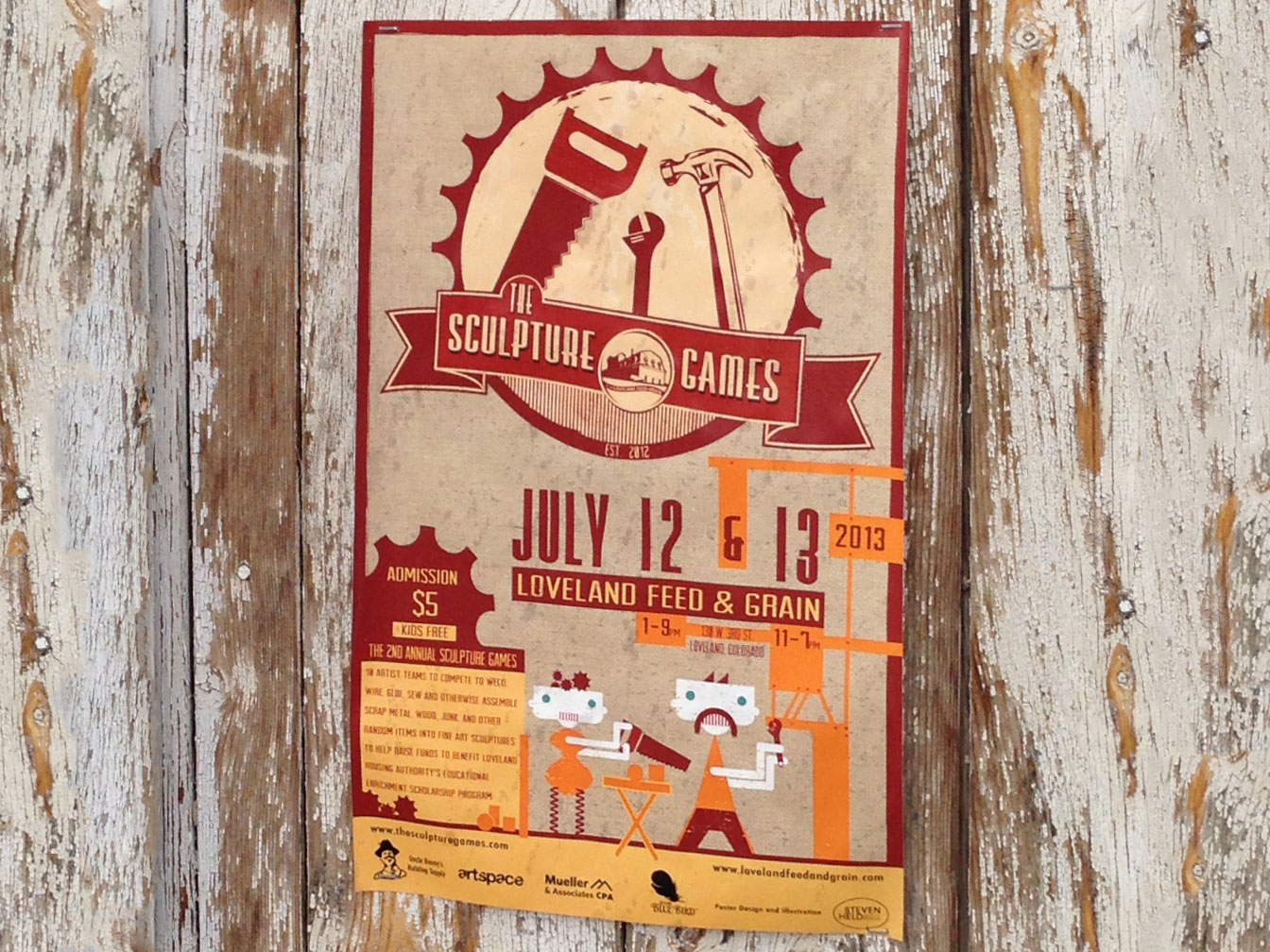
Poster Design
The 2nd Annual Sculpture Games poster design features two characters working on a sculpture which frames the event information.
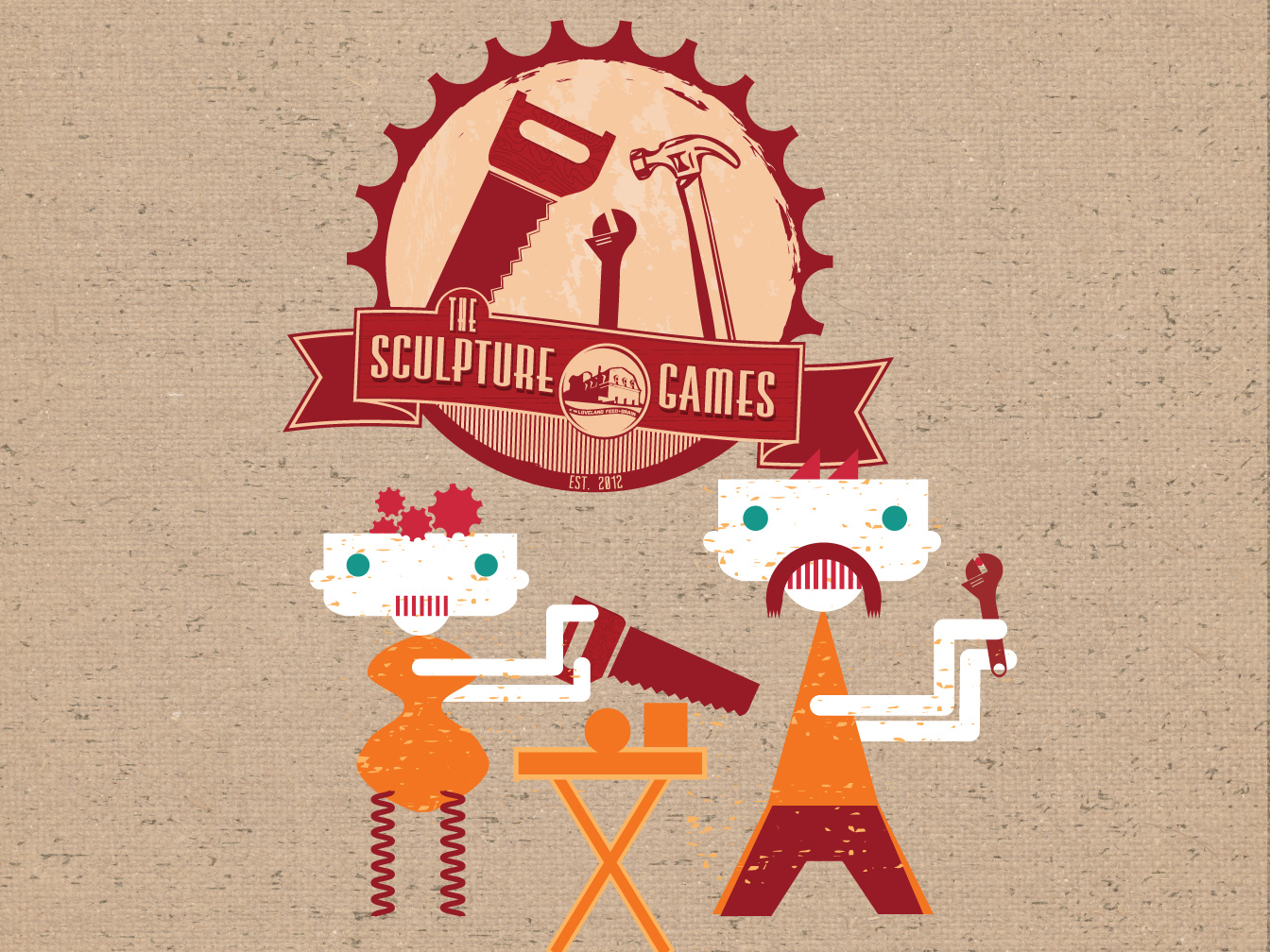
Illustration and Logo Design
The 2nd Annual Sculpture Games design. Here is the illustration characters and logo. Used to brand the 2nd Annual Sculpture Games in Loveland, Colorado.
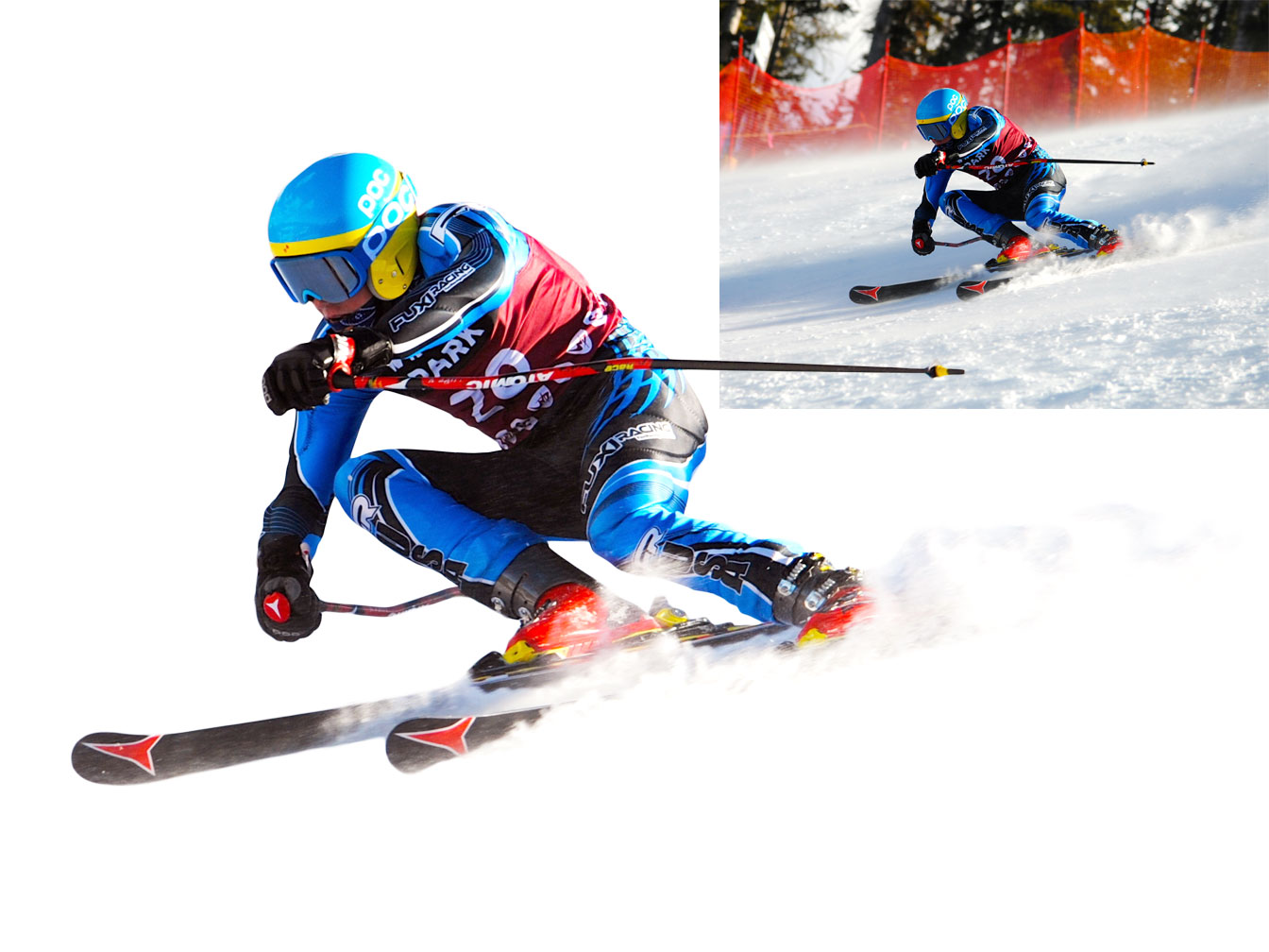
Background Removal & Color Correction
For Stunning Results
I offer color correction and background removal services for print and web. Check out all of these images in use on the Ski Club Vail website.
Work done while at Creative Navigation
Logo Design
Logo Design and Branding
Beegles Aircraft Service wanted a logo that showed flight and it needed to easily be translated onto clothing, hats and on work trucks. A good logo will always translate well. A great logo well speak volumes about the quality, history and story of the brand or service. This is what this logo does for Beegles.
Background Removal & Color Correction
For Eye-Popping Effects
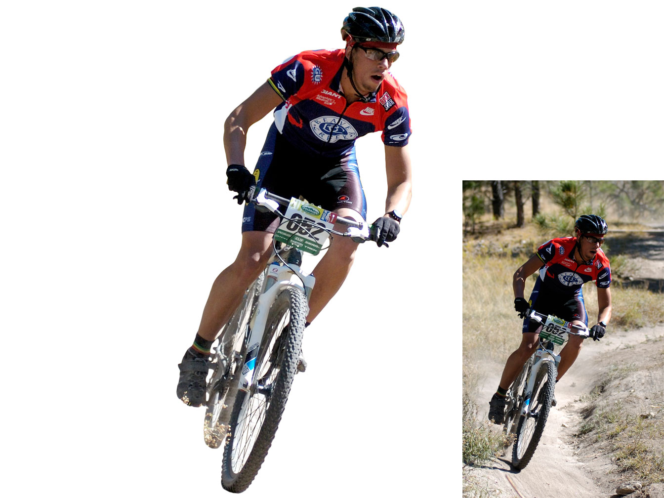
I offer color correction and background removal services for print and web. Check out all of these images in use on the Ski Club Vail website.
Work done while at Creative Navigation
Moody's Restaurant Logo
Moody's American Grill is a restaurant in downtown Greeley, Colorado. Come check it out! 801 9th St, Greeley, CO.
The logo needed a style reminscent of the 1920-1930's era but modern and classic enough to be relevant today. The owner took the name Moody's from an old photograph from a Moody's dry goods mercantile shop in downtown Greeley.
I chose to do a hand drawn typographic logo in order to give the name some character and retain a classic style. Lots of different sketches and letter shapes later, we arrive at this beautiful logo.
Because the logo is hand drawn it has some very unique qualities and looks very inviting, especially at a large size. This well thought out typographic logo was all that was needed to showcase this classic and charming restaurant.
Moody's Restaurant Logo
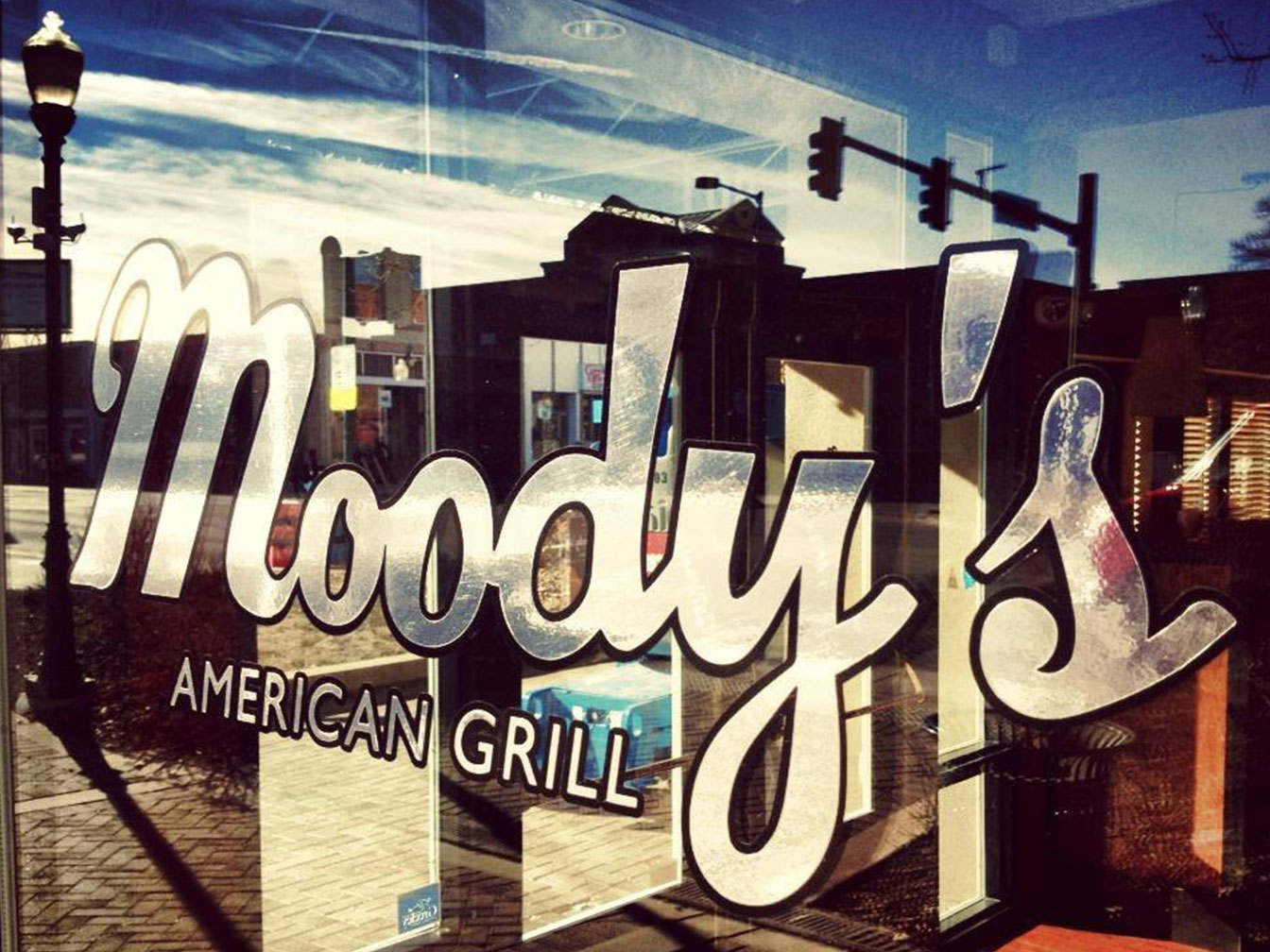
Moody's logo on window.
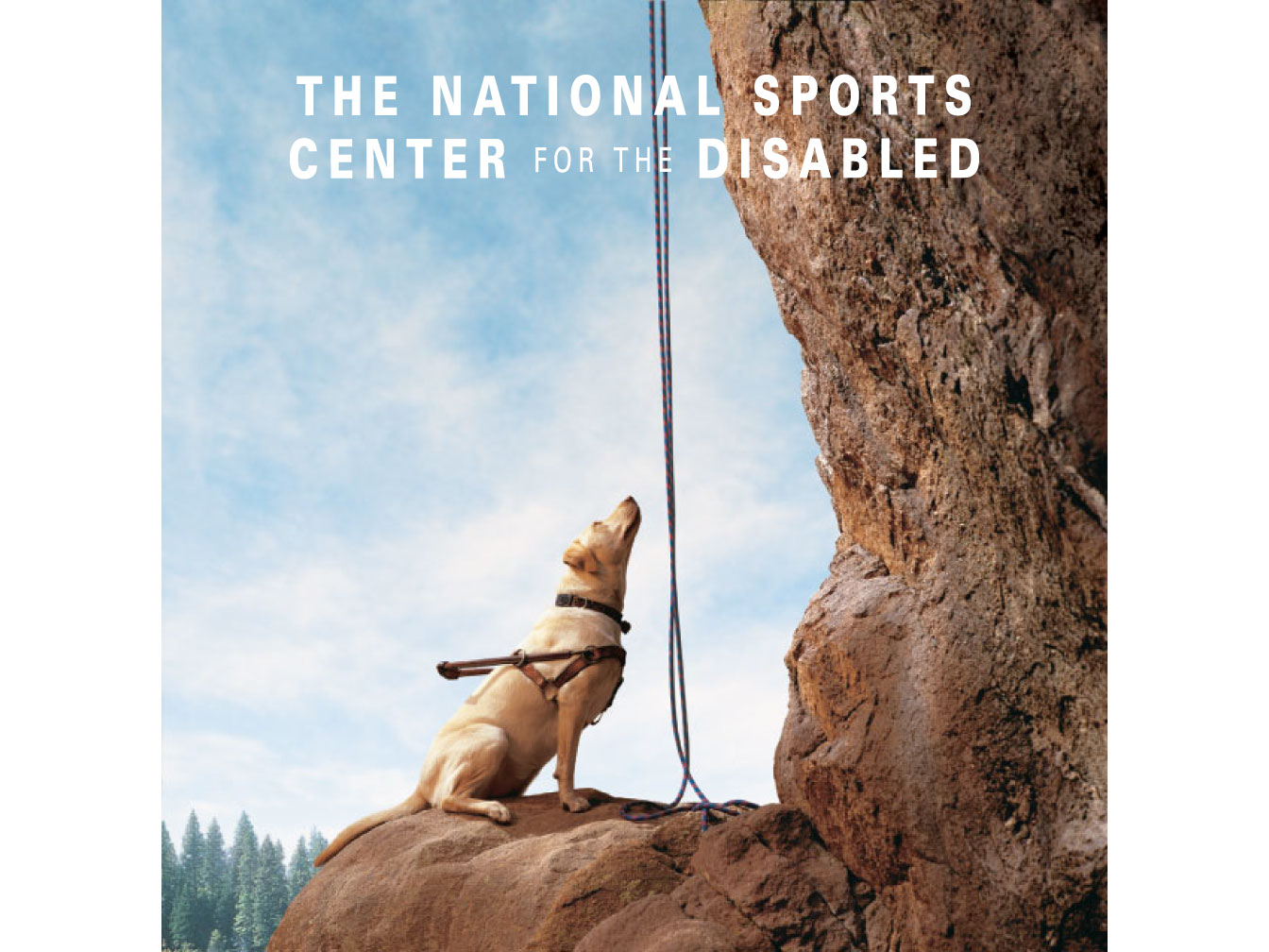
Ad Concept Design
An ad campaign to increase the awareness of the National Sports Center for the Disabled (NSCD). A guide dog is no longer needed for those empowered through the NSCD.
Work done while at Avocet Communications.
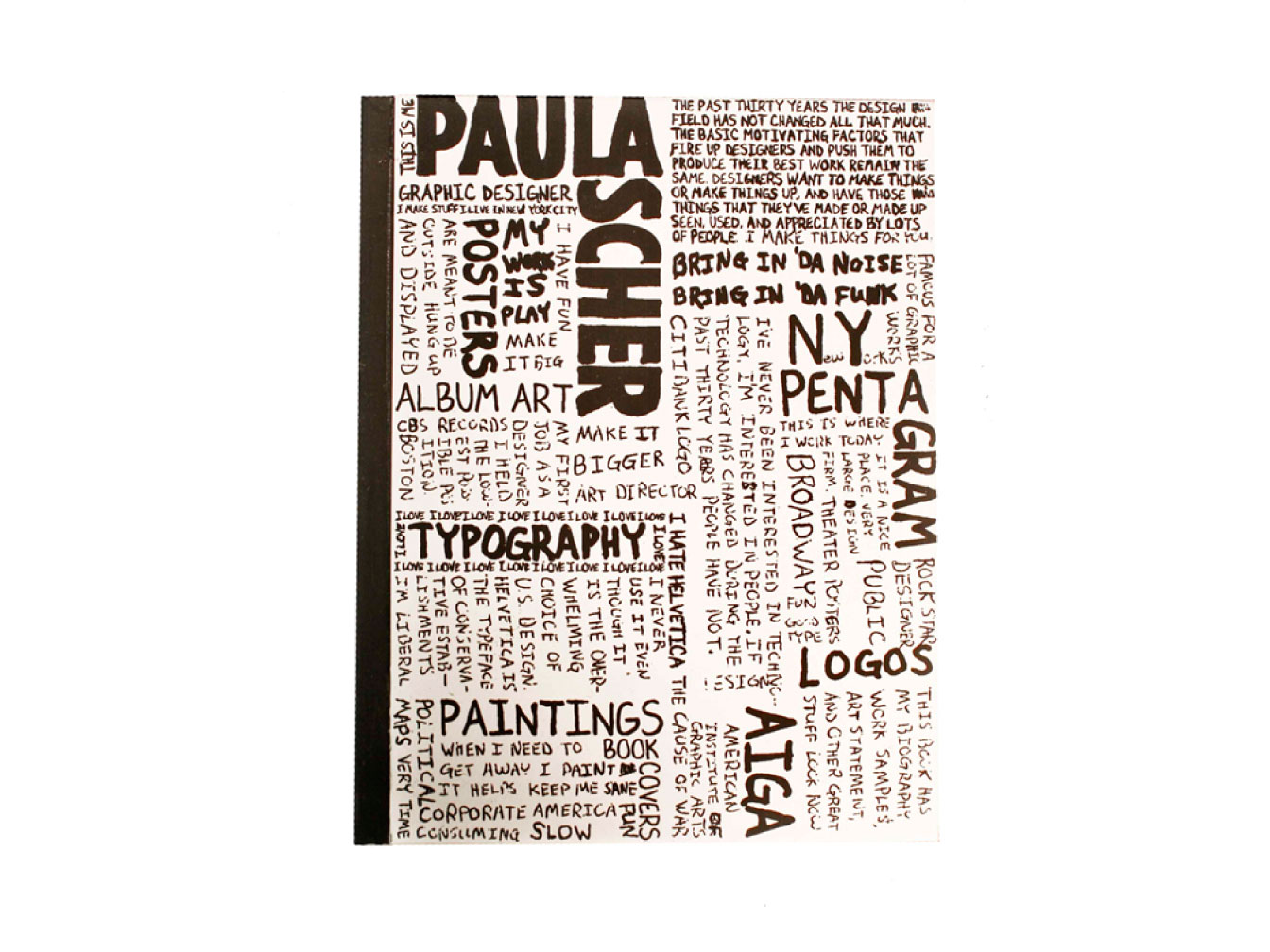
Paula Scher Book Cover Design
2009 ADCD Award Winner
Selected in the 2009 Art Directors Club of Denver Student Show for most intriguing use of media.
Book Making
This is the collector's edition coptic bound book of Paula Scher's work with a hand drawn typographic cover. Inside the book contains her work, writings, and a special edition artist's interactive CD with video, interactive information on some of her work, and a biography.
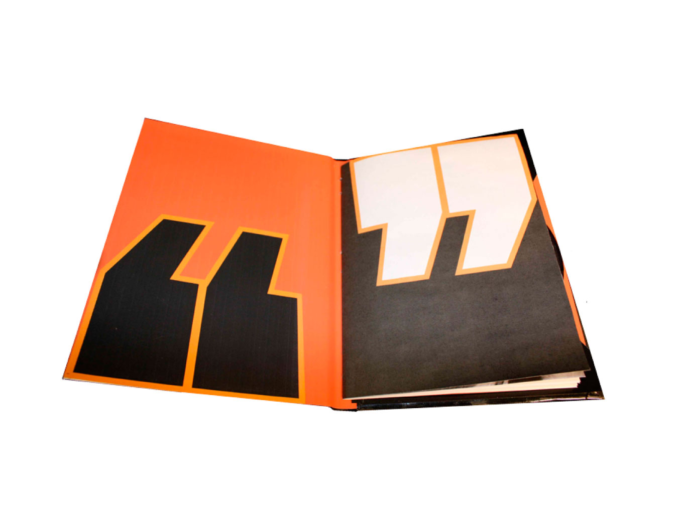
Book Spread Design
Inside Cover Spread
Paula Scher often utilizers big bold fields of color. That same style is used on this page to greet readers as they first open the book.
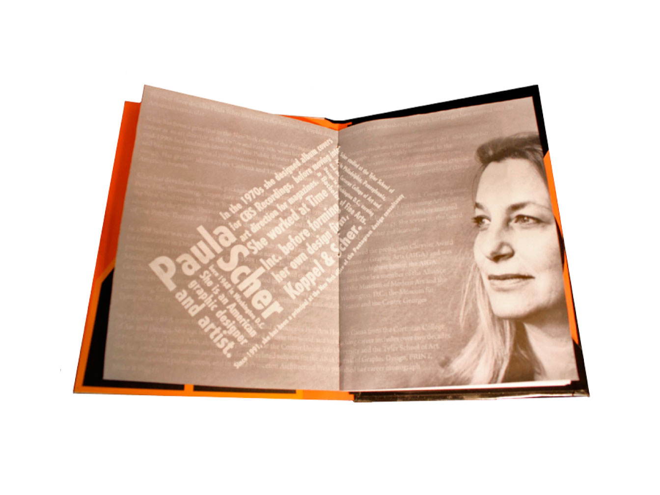
Page Spread Design
Biography Page
Paula Scher has a strong sense of typography and uses it as a design element. For this spread I pulled main aspects from her biography and created a block quote out of it. The designed typography bio has been placed over her full biography.
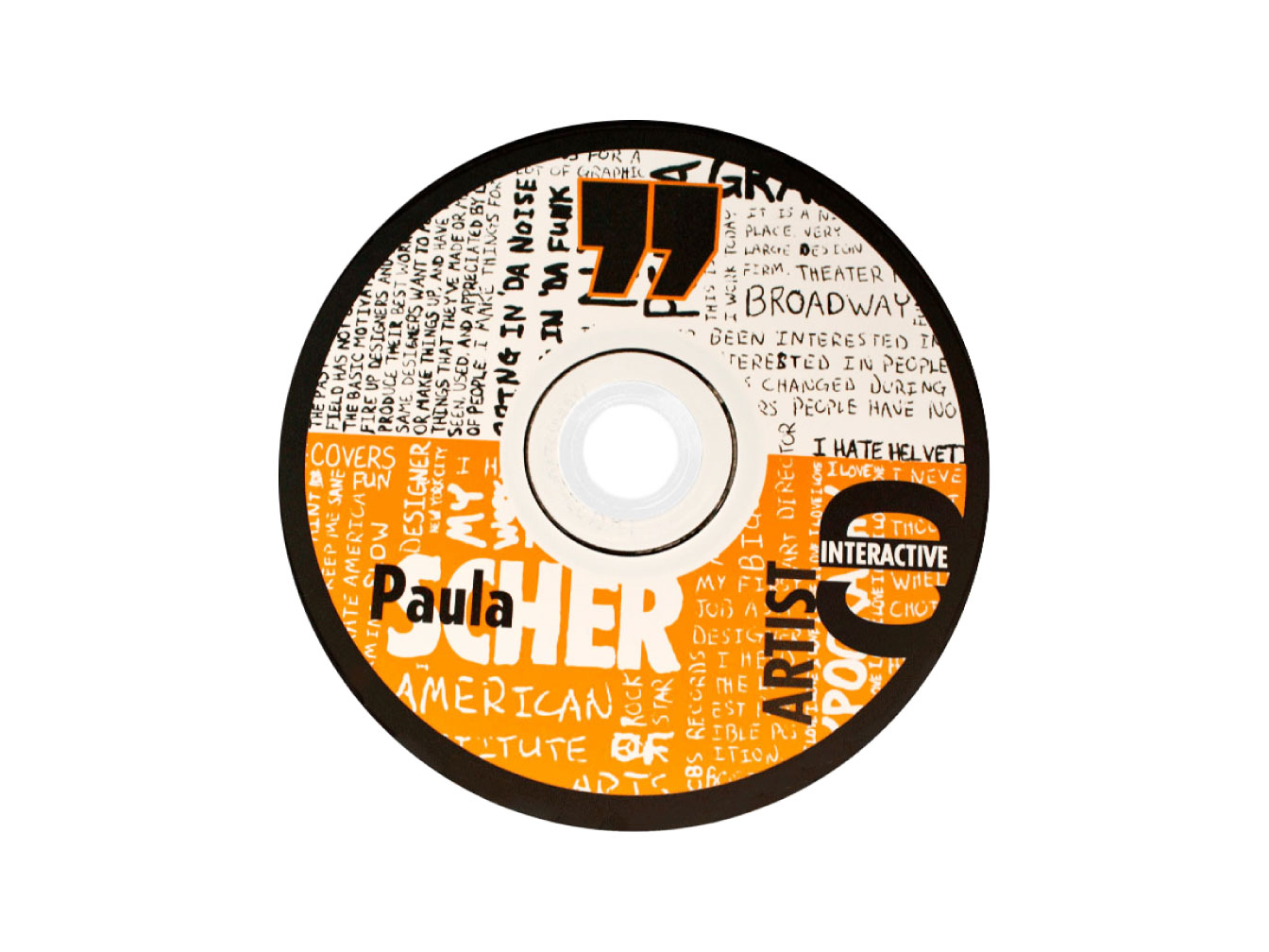
CD Design
CD Design
Hand drawn type on a CD featuring bold use of color and lots of hand drawn type.
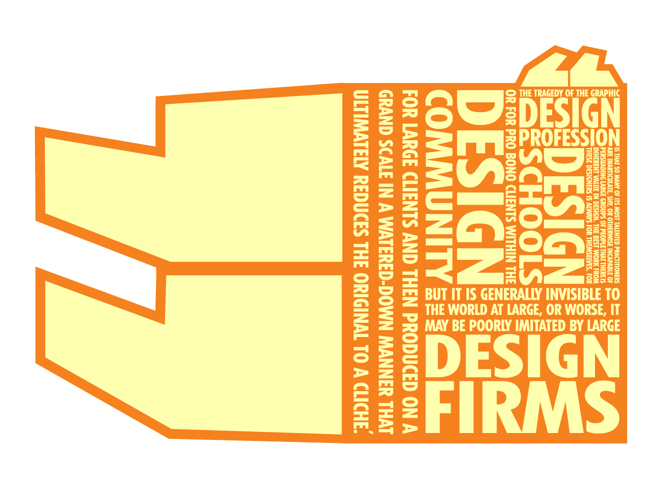
Paula Scher Quote
Paula Scher Quote
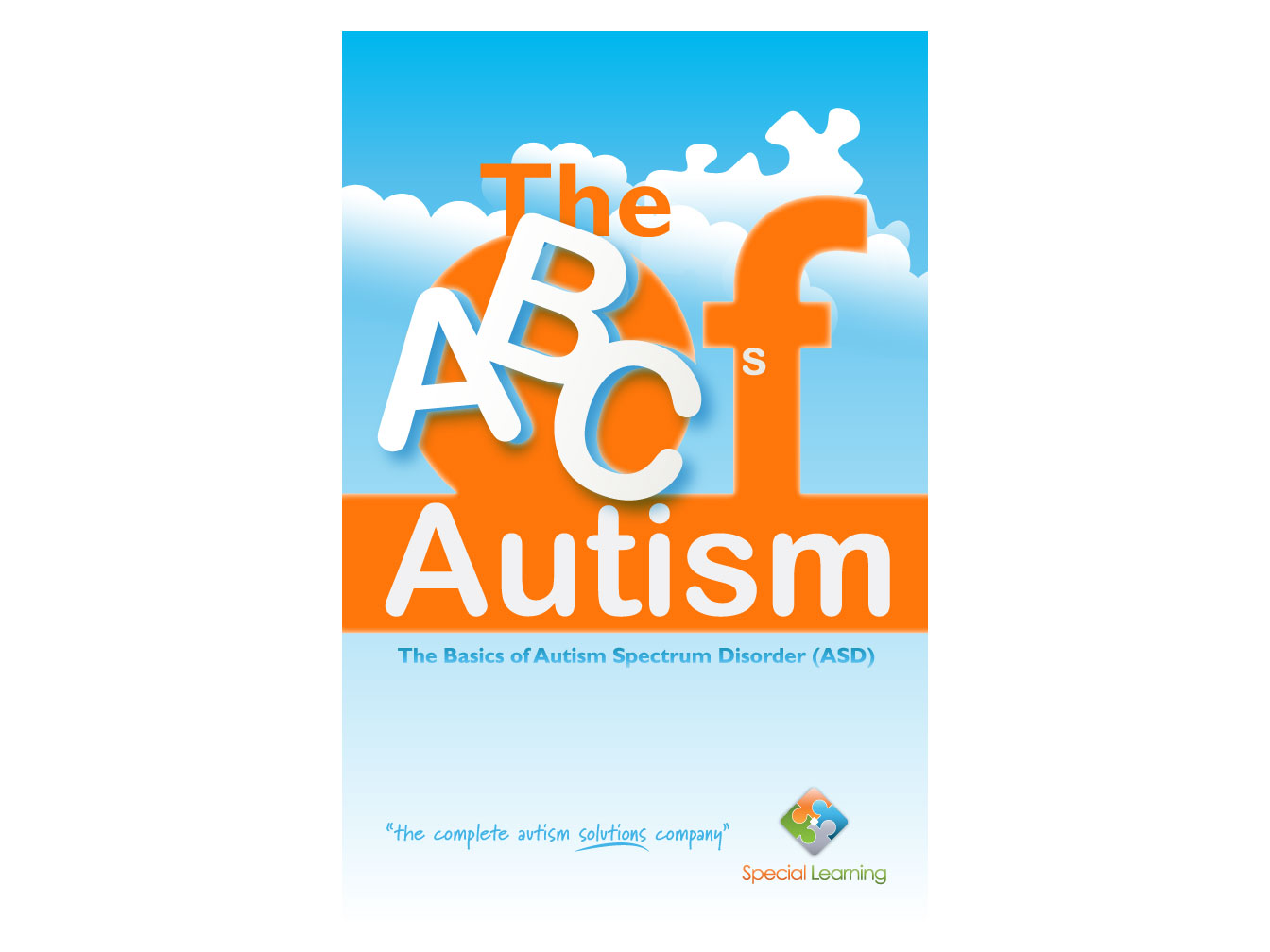
Book Cover Design
I was hired by Special-Learning to create book covers for a series of books about autism.
I was tasked to keep with their same aesthetic but was asked to create something eye-catching. In order to do this I had to research autism and understand the audience (parents of children with autism) and work to create a book cover that would appeal to them.
Parents who just learn that their child has autism undergo a series of emotions. The design of this book cover needed to feature a spirit of calmness, as well as grab the reader's attention quickly and encourage them to purchase the book to learn more about autism spectrum disorder.
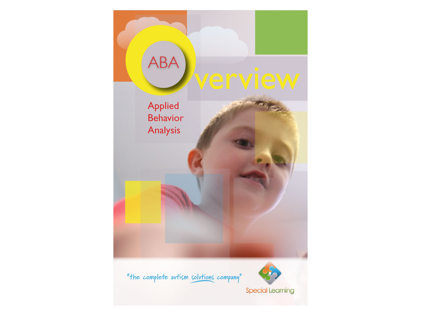
Book Cover Design
Applied Behavior Analysis. Autism is often described as being behind a veil. In this book cover that veil is shown through the multiple colored blocks but these blocks don't have to limit a child with autism. Through ABA, certain behavior can be achieved.
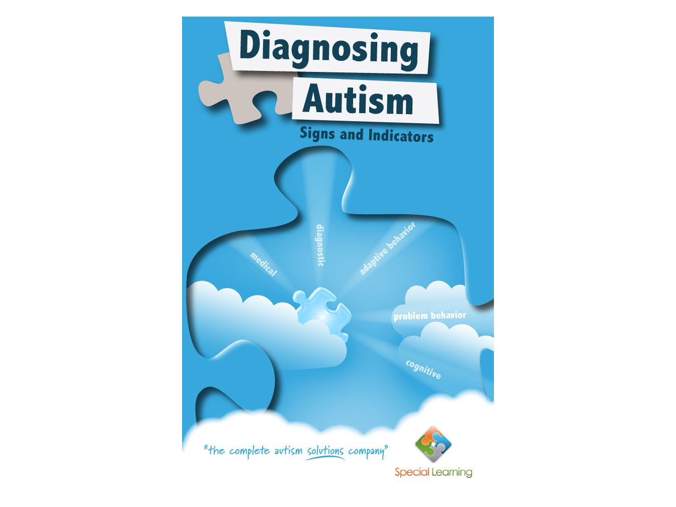
Book Cover Design
There are five categories for the successful diagnoses of autism. This book gives an overview of all five categories and the cover needed to showcase them in a manner that was not foreboding but instead would install a sense of calmness to the audience.
Startup Company Logo Design
A resource imaging company contracted my design services to create a corporate identity logo for their startup company. Waveseis was formed from the words seismic and waves. It was this emphasis of the underground seismic waves and the capital 'W' that became the core ideas for this logo.
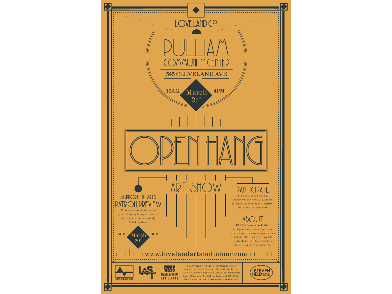
Open Hang Poster
Open Hang in Loveland, Colorado is a new event offered to local artists in Loveland to display art. All proceeds go to support the Loveland Art Studio Tour and future art events.
Client wanted an Art Deco theme design with some modern flair to promote the event. Large and small posters were produced.
The font and two-tone color was utilized in the Art Deco and print style of that era.
Realtor Logo Design
Logo Design and Rebranding
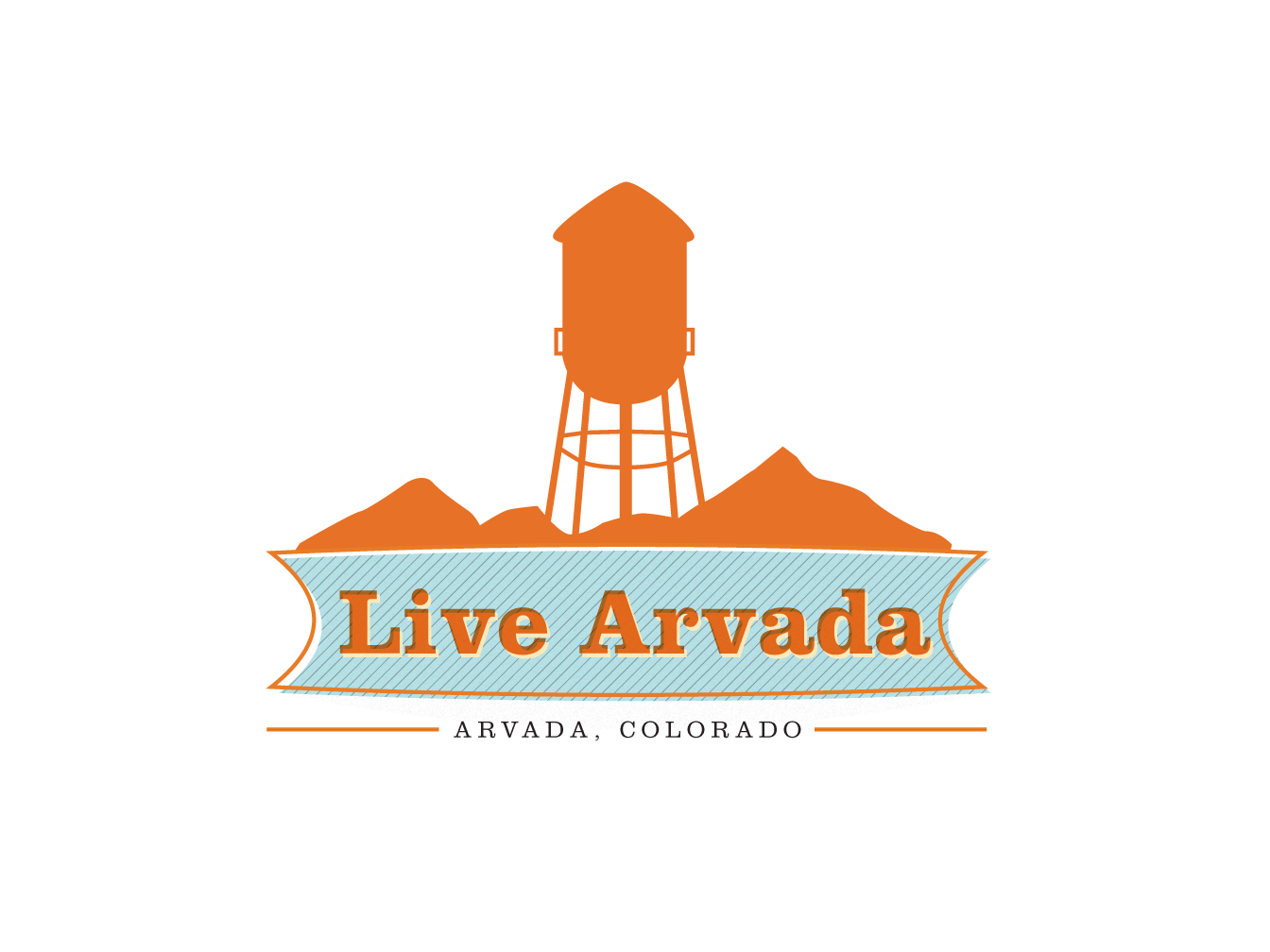
I teamed up with a realtor to design and market her services in the city of Arvada, Colorado (within the Denver Metro area).
This realtor logo, unlike a typical head shot, will help her services stand out among the competition. The eye catching color makes her more immediately visible in the realtor section of the newspaper. Furthermore, the water tower graphic communicates a familiarity with the city of Arvada. I'm very excited to see how this logo increases her client numbers in the coming year.
Arvada, Colorado is part of the Denver metro area facing the Rocky Mountains. The city is known for an old water tower that has become the center of historic olde downtown.
I chose to emulate the offset printing style in order to hint at the history and heritage of the city while using bright colors and clean type to infuse a modern flair. My client thought it was important to bring together the old and new when representing the city because she knows that is the essence of its charm.
Technology Brand Identity Design
Technology Firm Logo Design
A minimalist branding mark for a tech firm creating home electronic devices to be used in the so called "Man Caves." Thus the name 'CaveTec.' Look for the hidden T within the C in this logo.
Suicide Prevention Poster
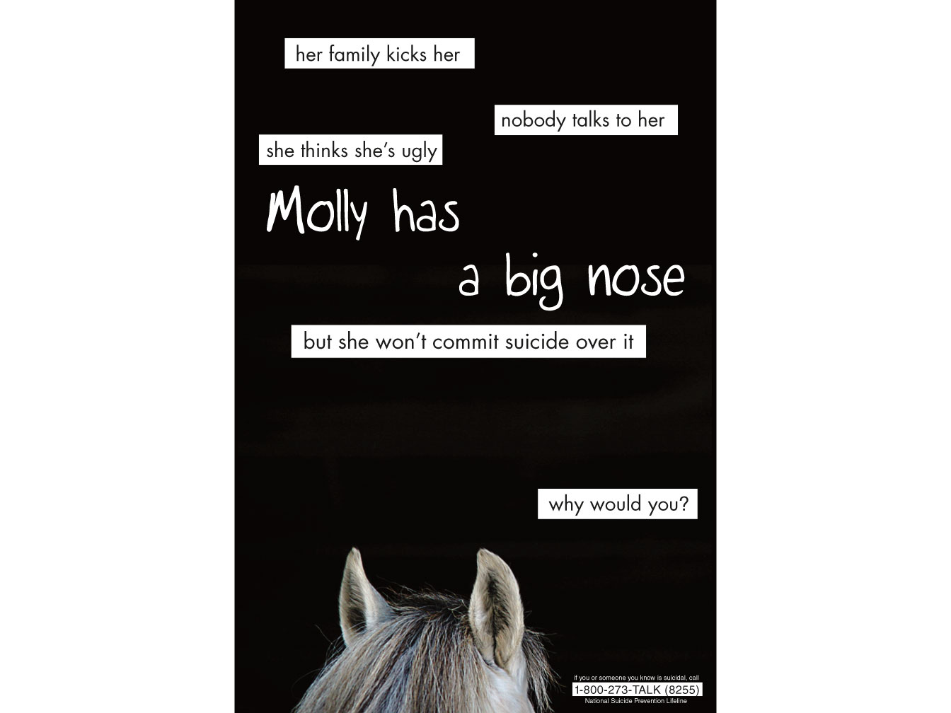
The concept is based on the fact that animals do not commit suicide, so why would you? This large 24"x36" poster is meant to draw in viewers from a distance with its large expanse of negative space and stark black color. The horse imagery and type provide some humor but the message is still strong and very memorable.
Illustration
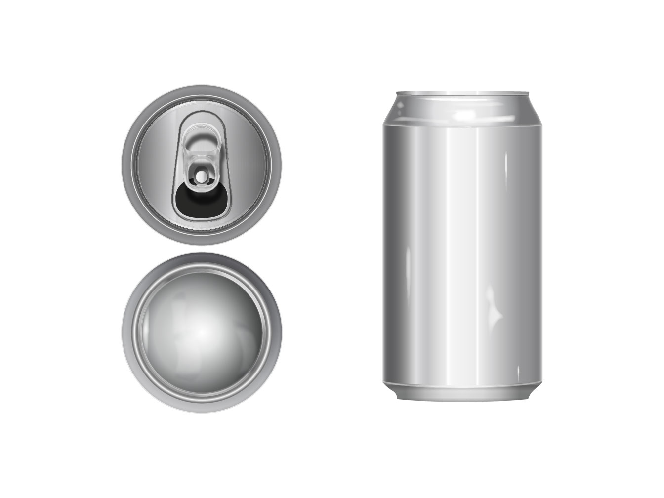
An aluminum can vector illustration completely rendered using Adobe Illustrator.
Logo Design
Logo Design and Truck Wrap
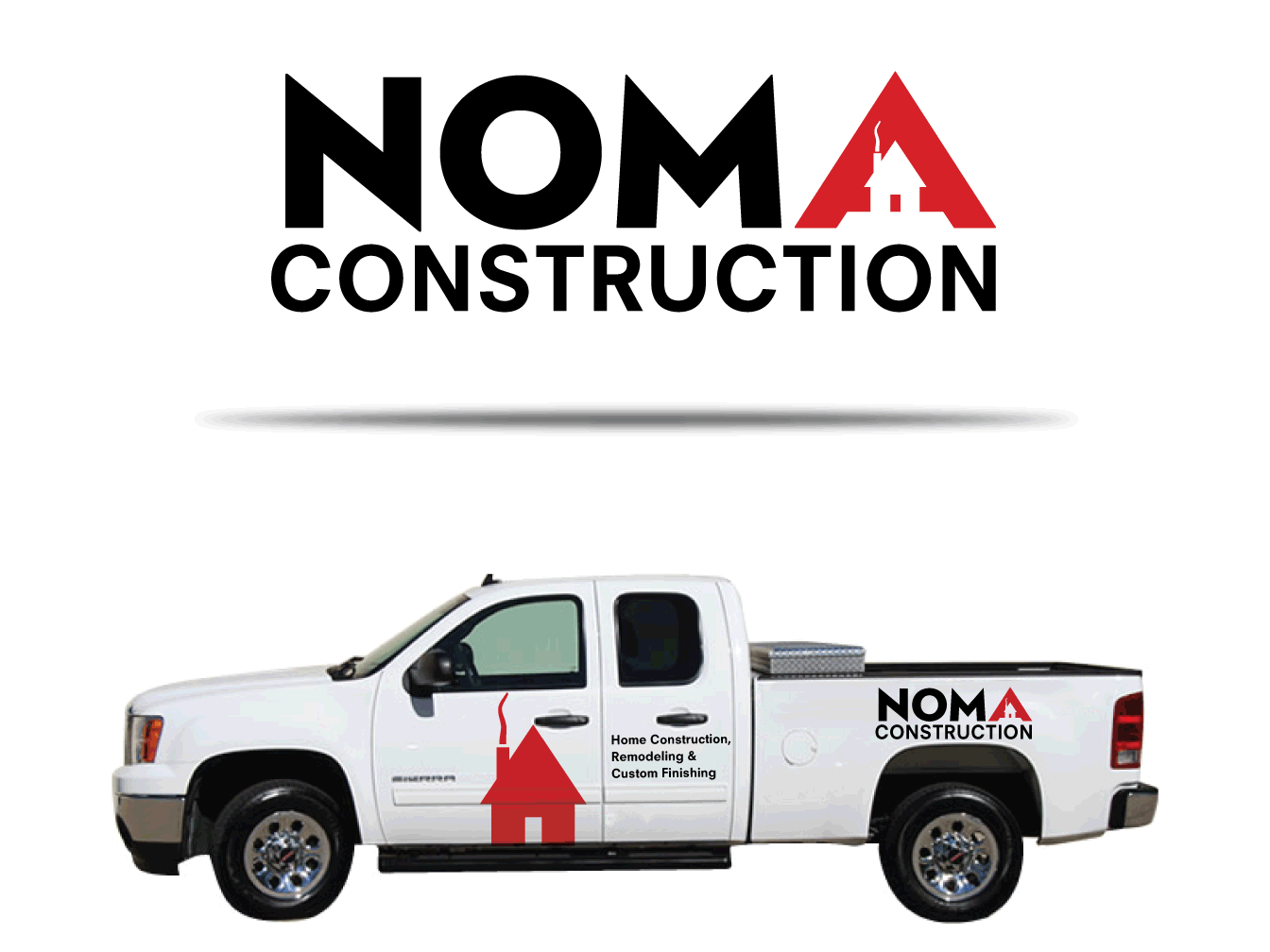
Noma is the company owner's name and he wanted a logo that stood out from the crowd. Here a minimalist style and bold red color allows for this vehicle wrap and logo to be instantly remembered.
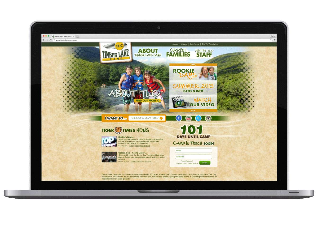
Pixel Perfect Web Design
Summer Camp Web Design
This massive overhaul of a website required pixel perfect layout in CSS. Design from Photoshop to web using PHP and CSS3.
Work done while at Creative Navigation
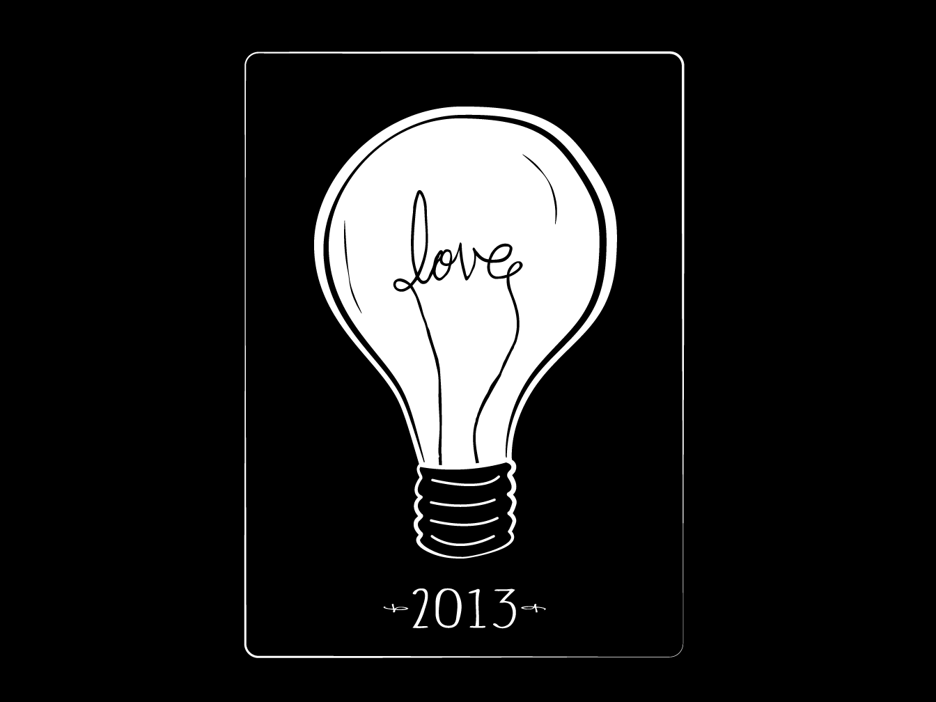
Illustration and Logo design
Loveland, CO has a theme of hearts obviously. Beginning in 2012 the city helped to rennovate an old abandoned feed and grain building and turned into a artist studio and gallery. This logo and illustration was created for one of their shows held annually called Love + Light. All artwork had to have the theme of love or light or both.
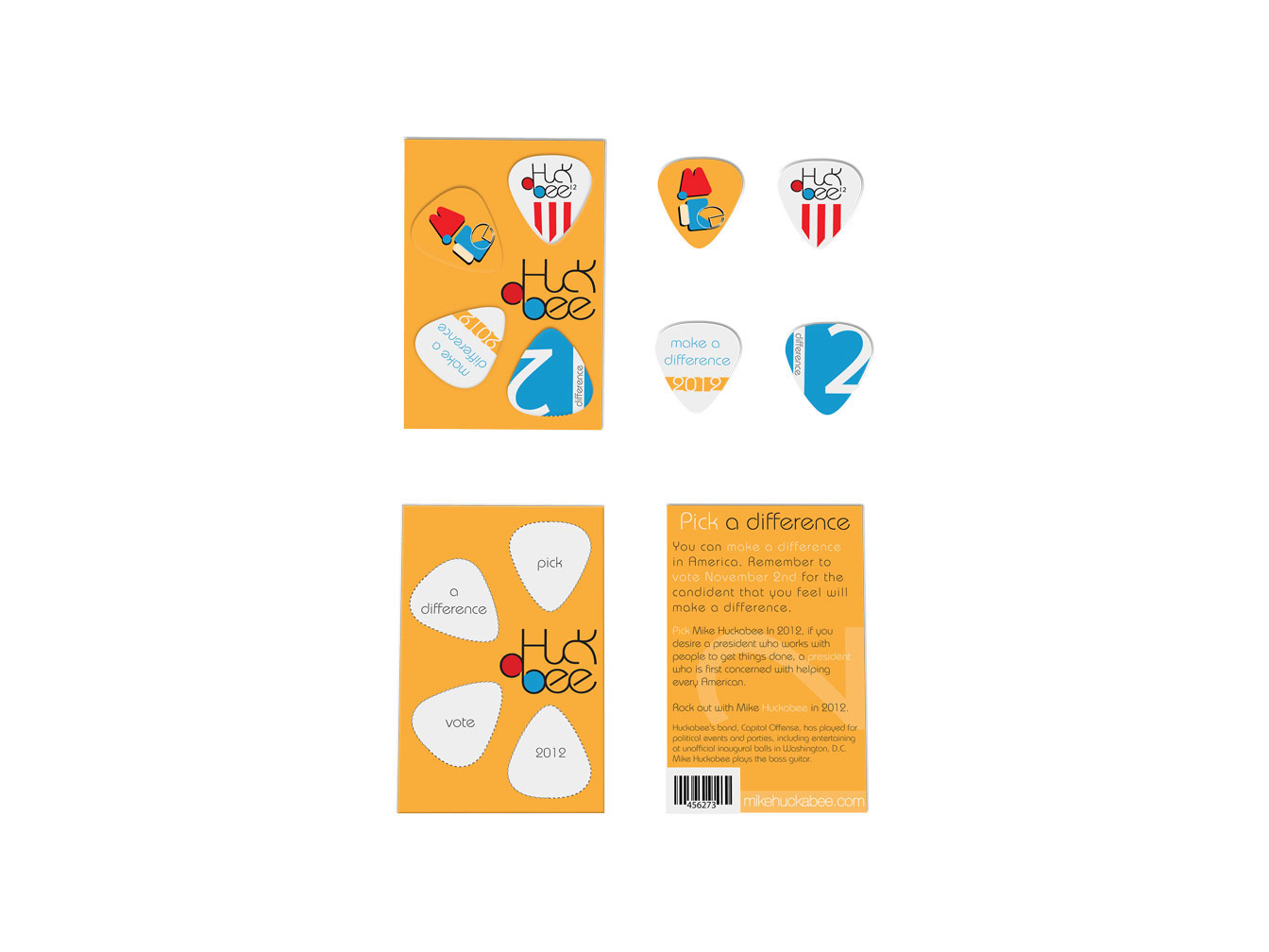
Guitar Pick Design
Huckabee rocks the bass guitar. As a different way to introduce the candidate, potential voters will receive this handout with a series of custom designed guitar picks. As the picks are taken off the campaign card reveals. Pick — A Difference — Vote — 2012.
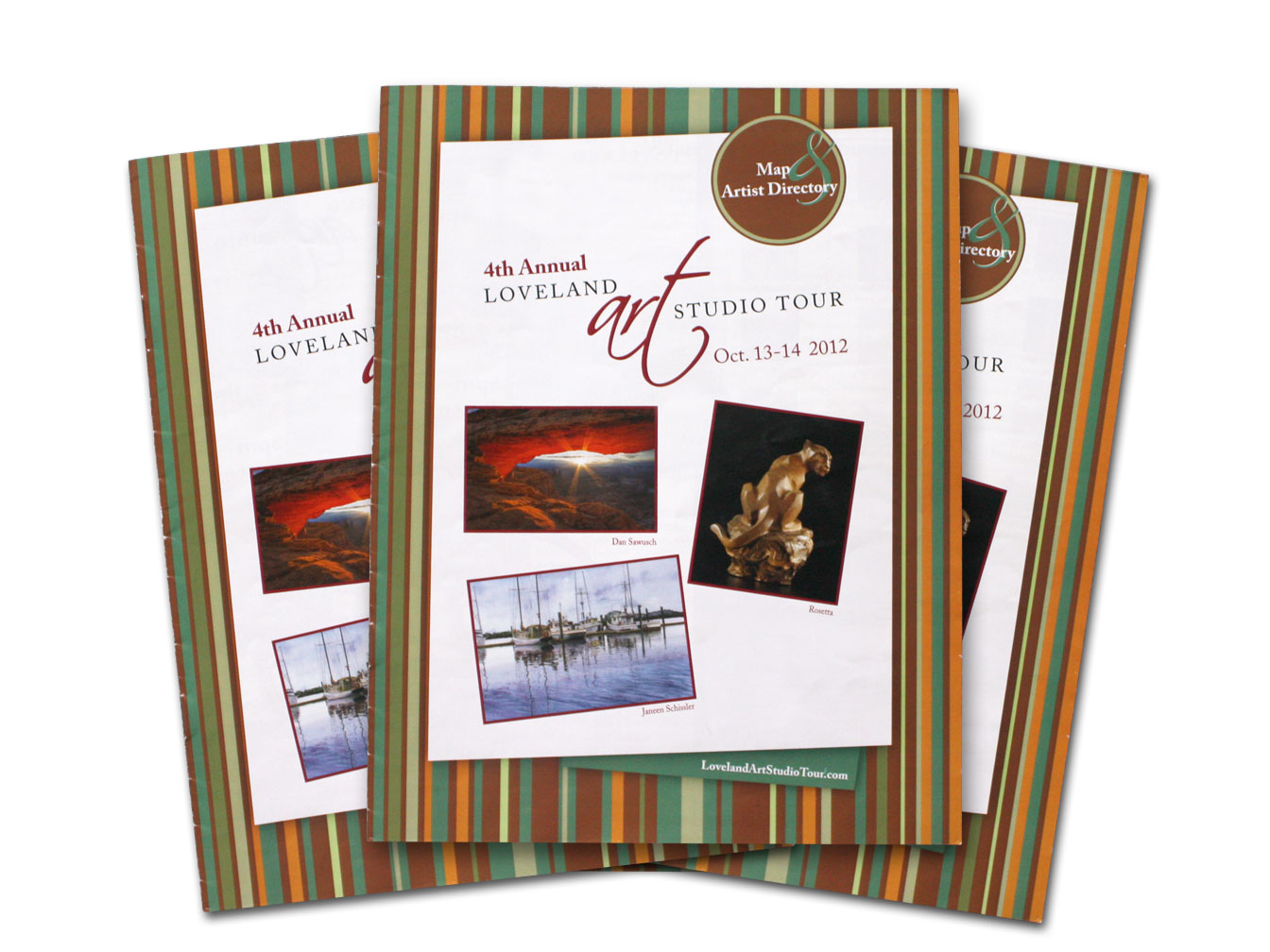
Loveland Art Studio Tour Brochure Cover Design
Loveland Art Studio Tour
Pattern graphics were used to reflect the fall colors of the mid October Loveland Art Studio Tour.
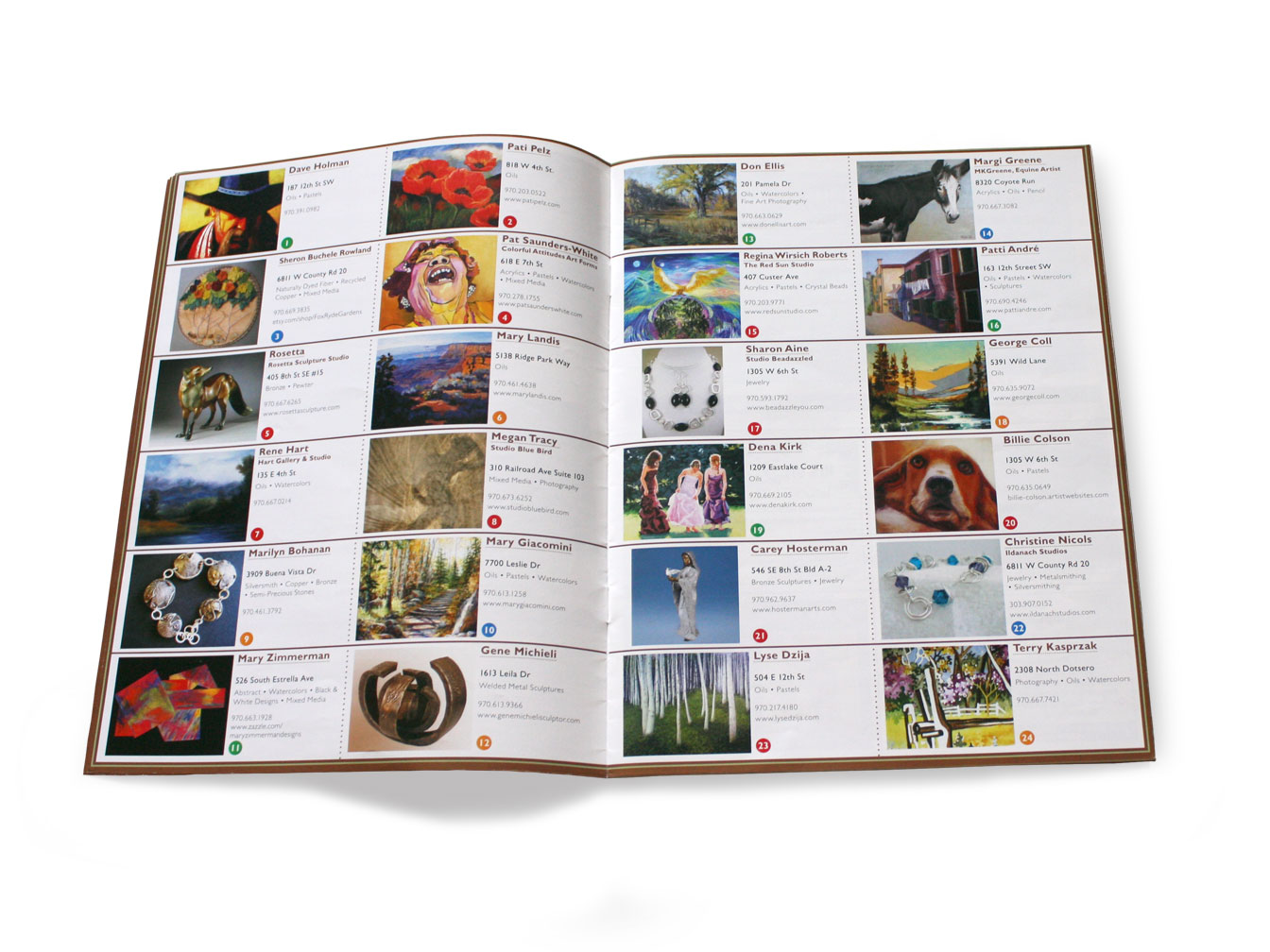
Loveland Art Studio Tour Page Spread
Loveland Art Studio Tour
Here is an inner page spread featuring some of the artists of the 2012 Loveland Art Studio Tour. An image of each artists' work accompanies a color coded circle that designates his/her studio location on the Loveland map.
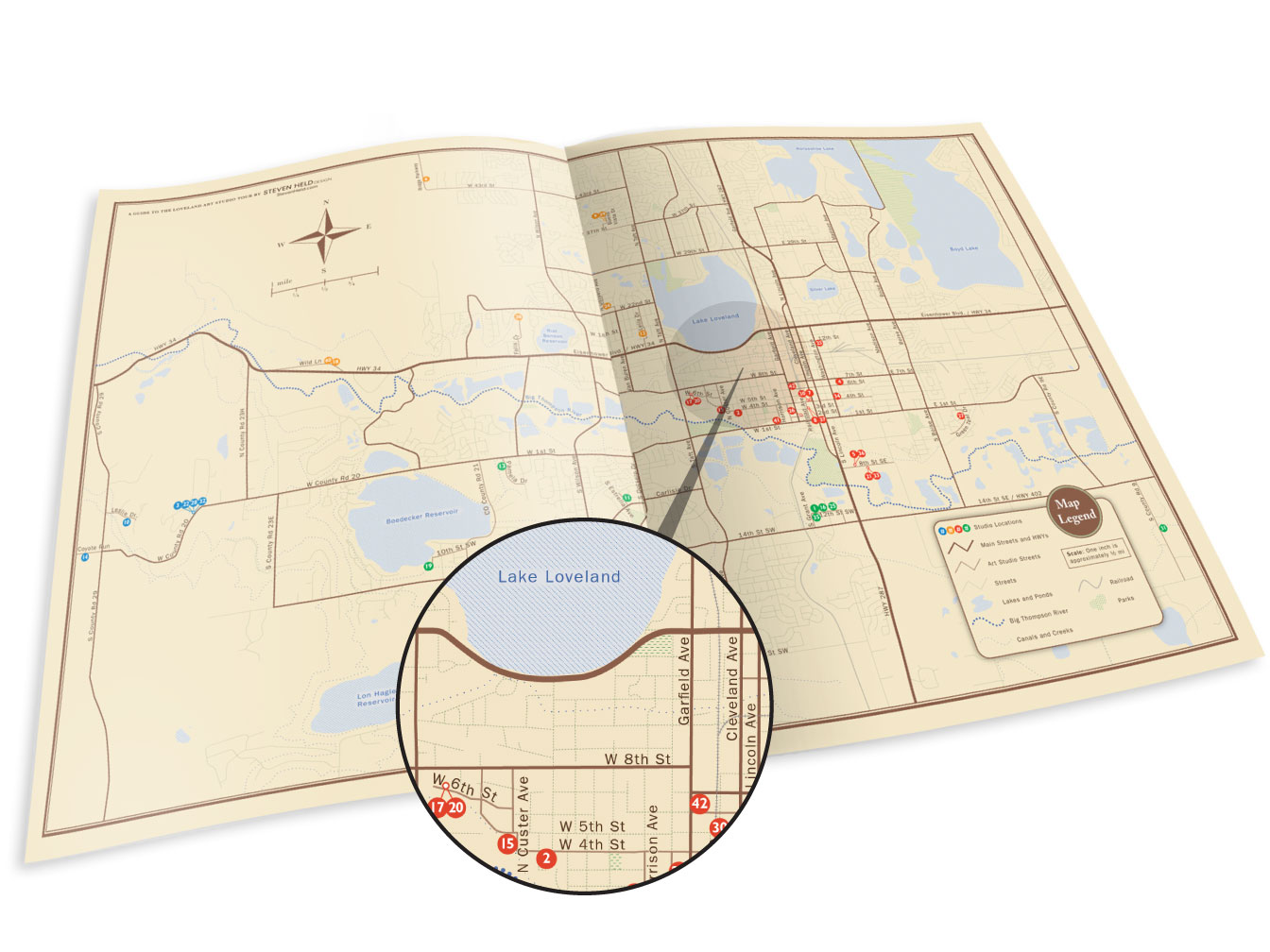
Loveland Art Studio Tour Map Design
Loveland Art Studio Tour
This city of Loveland, Colorado map was meticulously illustrated to feature every art studio along the Loveland Studio Art Tour. Every street, park, and body of water was drawn in a vector program so that it can be edited each year with any new information. Great care was taken to insure complete accuracy and to produce not just a functional map but one that is also very eye pleasing.
The map was specifically designed to be the center spread in the brochure to allow it to be taken out and used as a map.
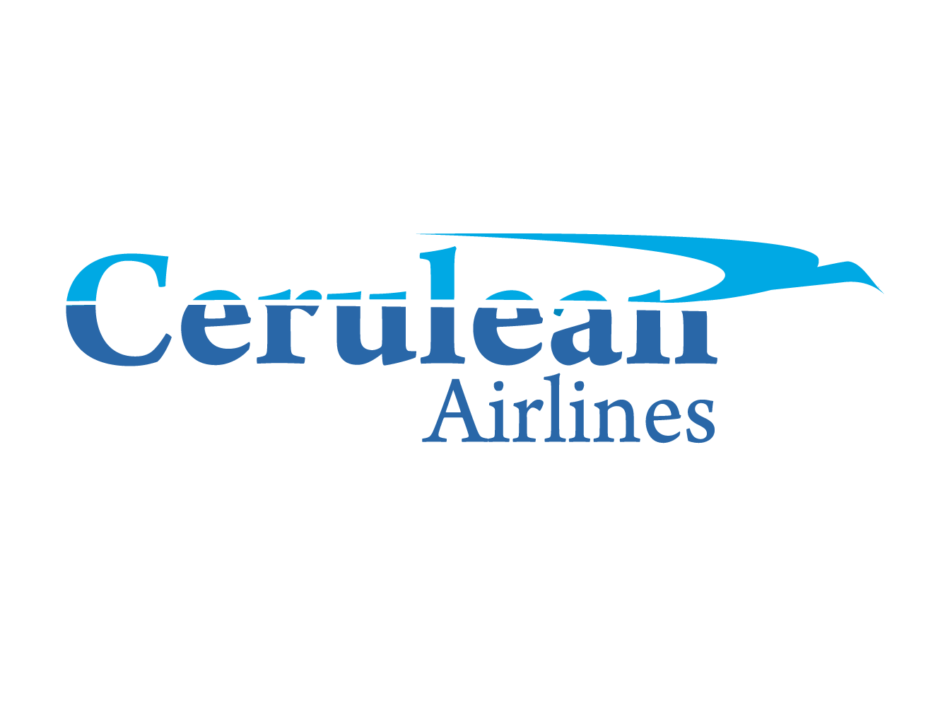
Logo Design
This logo alludes to the feeling of flight. The light blue represents the sky and gives a feeling of safety. The bird flies through the type and sky leaving behind a jet white cloud.
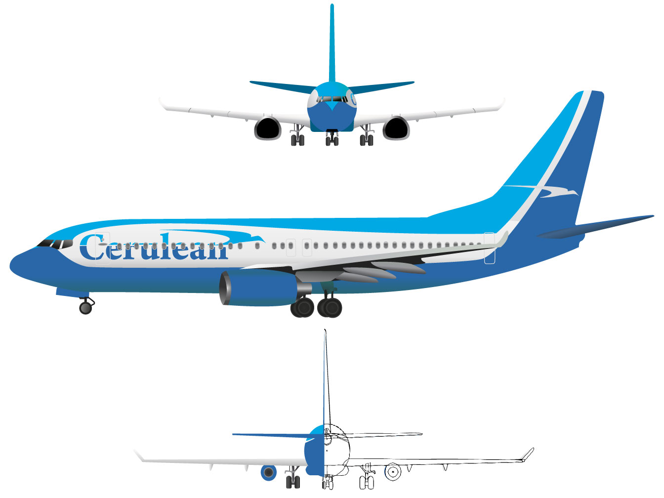
Airplane Illustration
Front, profile, and rear views of an airplane body, illustrated with Adobe Illustrator.
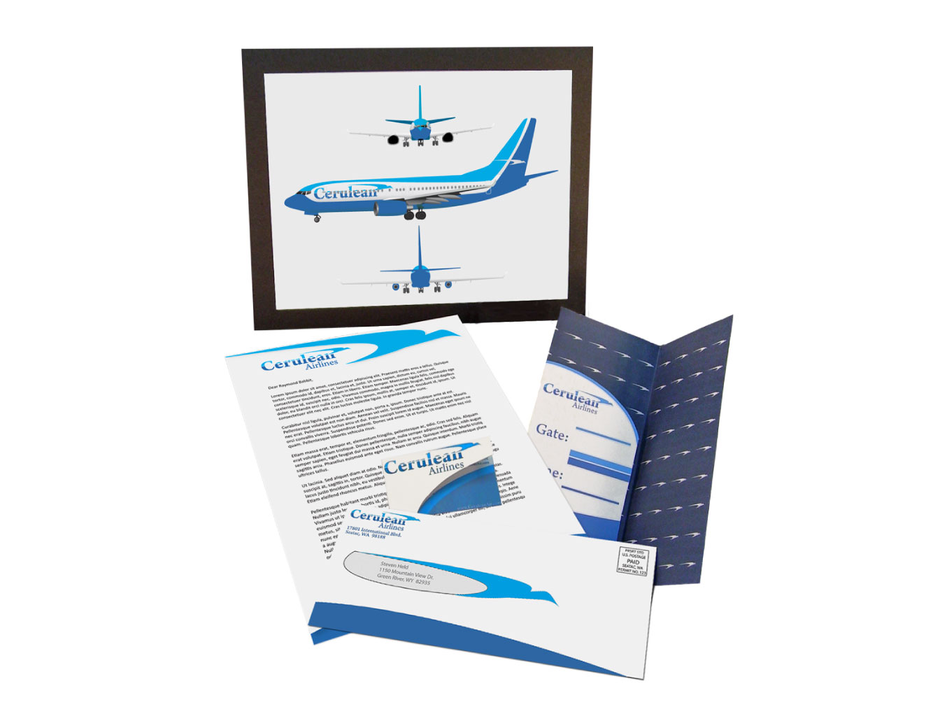
Cerulean Airlines Campaign Design
Front, profile, and rear views of an airplane body with business identity. This included a letterhead, business card, logo, envelope, and a ticket holder.
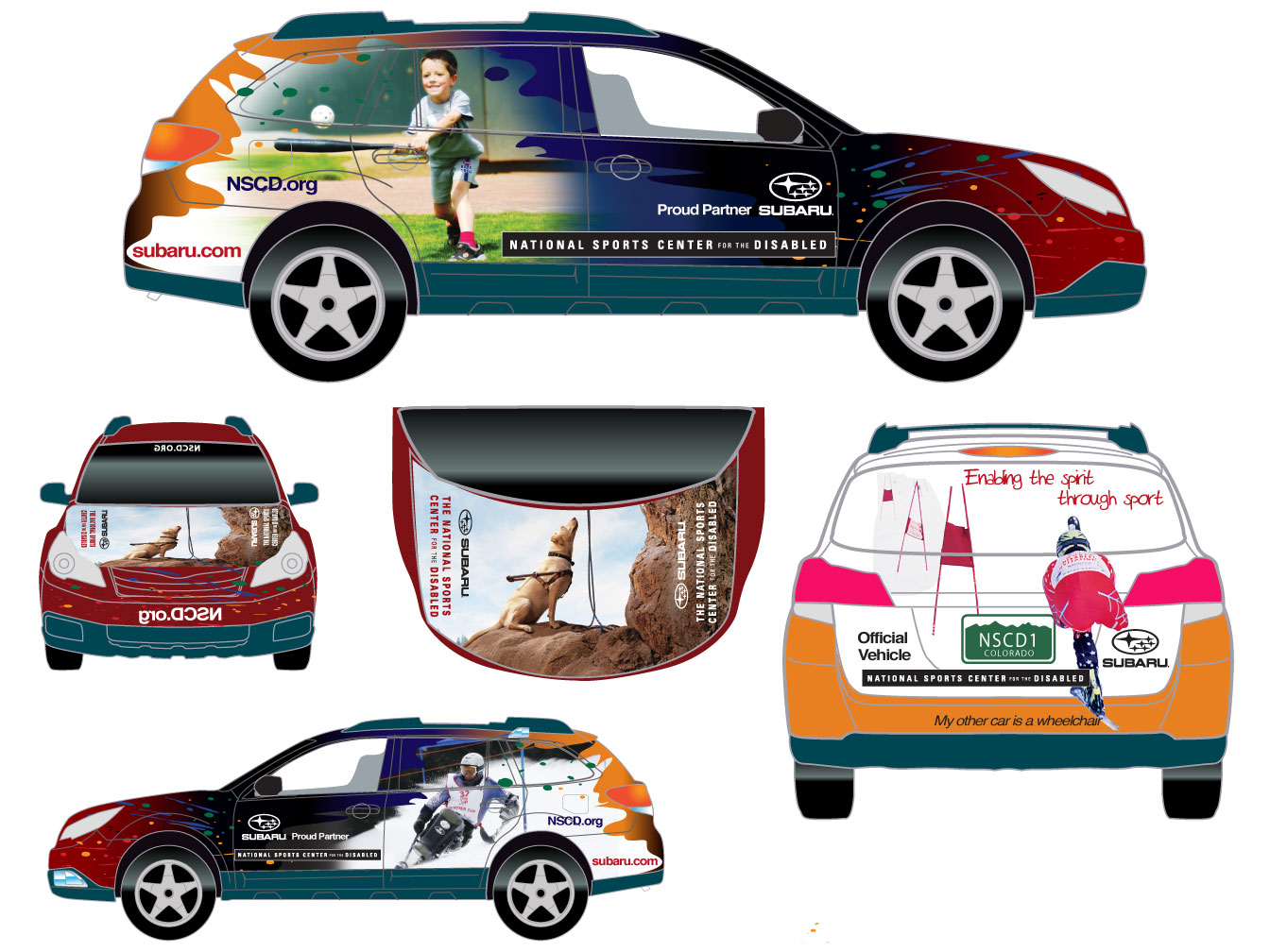
Car Wrap Design
A Subaru car wrap design for the National Sports Center for the Disabled (NSCD) featuring the sports and activities offered by the organization.
Work done while at Avocet Communications.
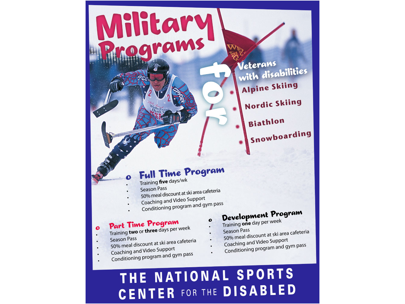
Magazine Ad Design
Magazine ad to introduce the disabled military veteran programs at the National Sports Center for the Disabled.
Work done while at Avocet Communications.
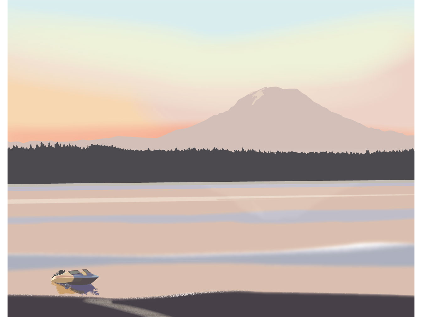
Mt. Rainier Illustration
A vector landscape illustration of Mt. Rainier over the Puget Sound.
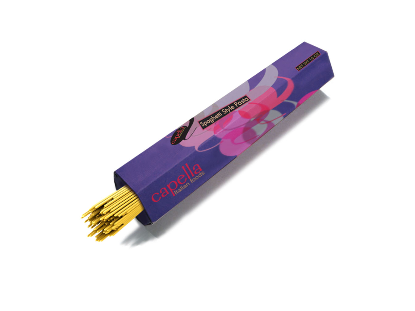
Capella Spaghetti Packaging
Capella foods sing! Each product comes in vibrant and bright packaging. This six-sided spaghetti box with its bright purple and lavish colors definitely stand-out among the drab and boring pasta boxes on the grocery shelf.
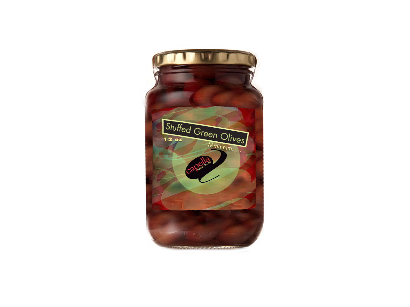
Capella Olive Jar Packaging
The label design features a transparent "a" repeated in a pattern of multiple colors to emphasize the multiple tastes found within this jar of olives.
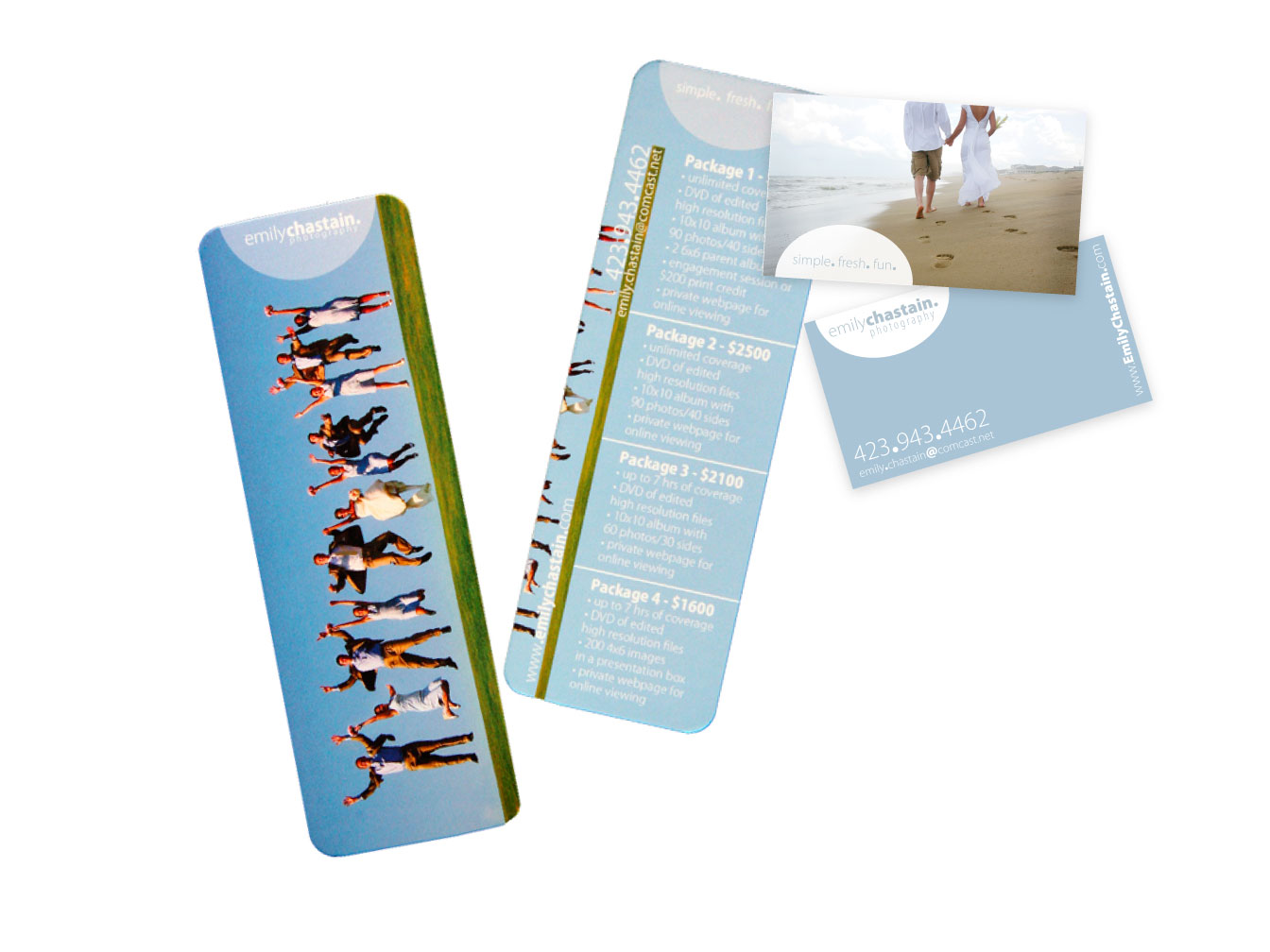
Emily Chastain Photography Studio Design
I was asked by Emily, of Emily Chastain Photography, to design her business card and to create a unique advertising piece that clients would use and not throw away. Her tagline is simple.fresh.fun. and she wanted to portray that in the design.
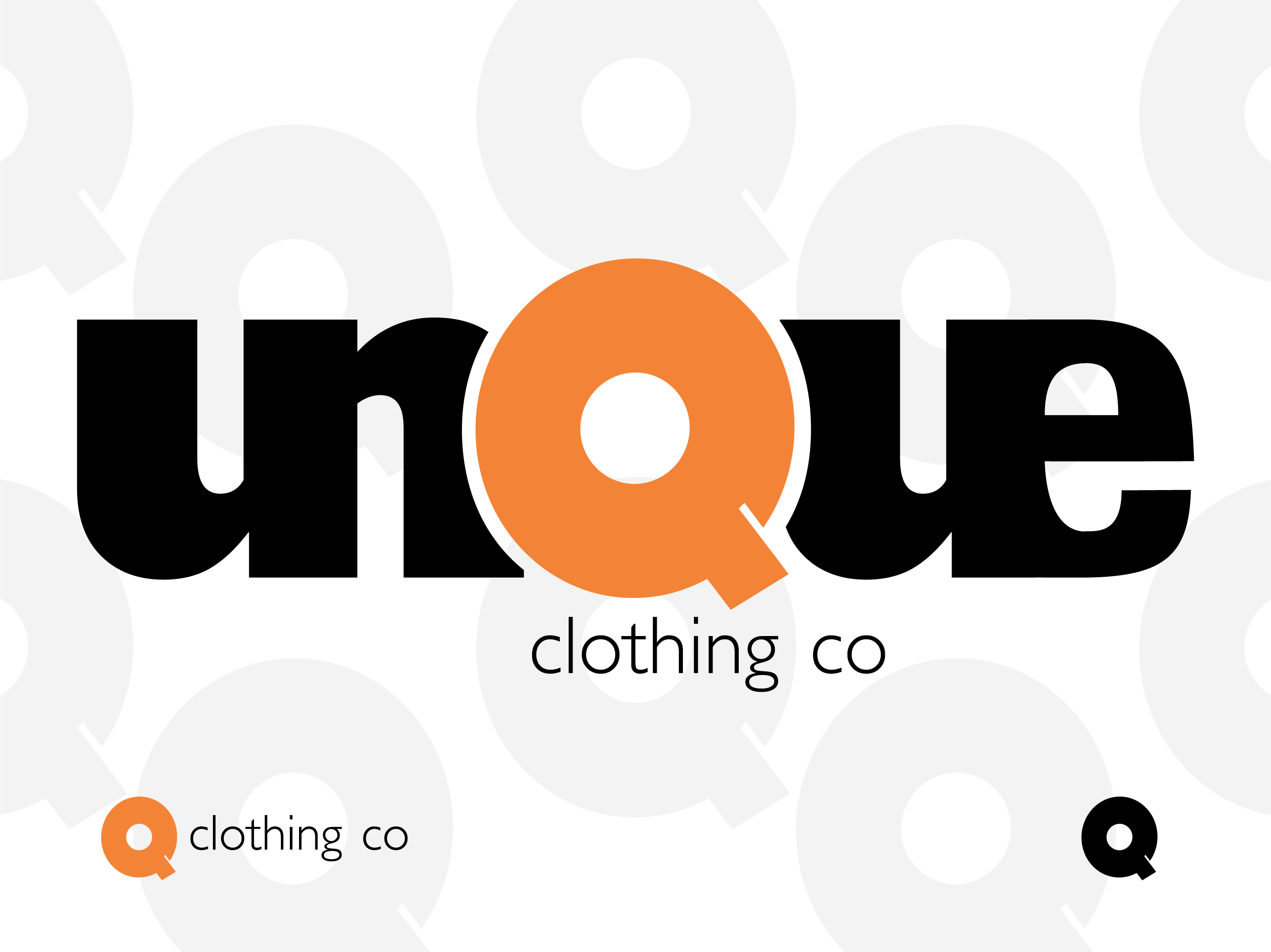
Logo Design
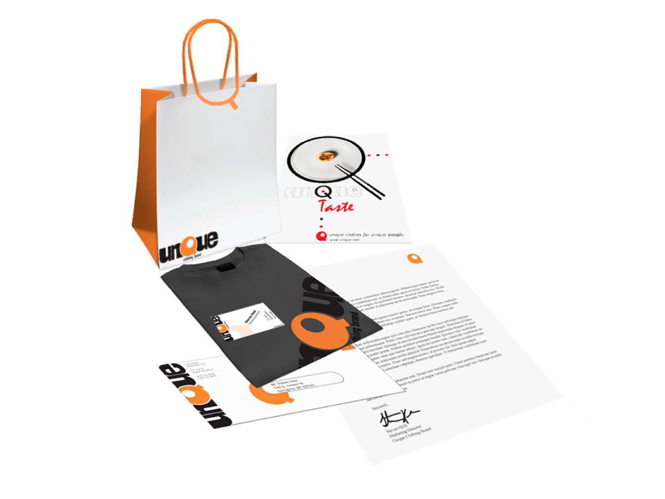
For the Unique Clothing Brand design, I experimented with emphasizing elements that are unique. The letter 'Q' itself is rather unusual and therefore gets the special treatment and color. The orange color is fun, playful, and eye catching. The letter 'i' which can be found within the bold 'Q' completes the design and illustrates that I am Unique.
Clothing Company Design
Shopping bag, magazine ad, business card, t-shirt, envelope, and letterhead for Unique Clothing Brand.
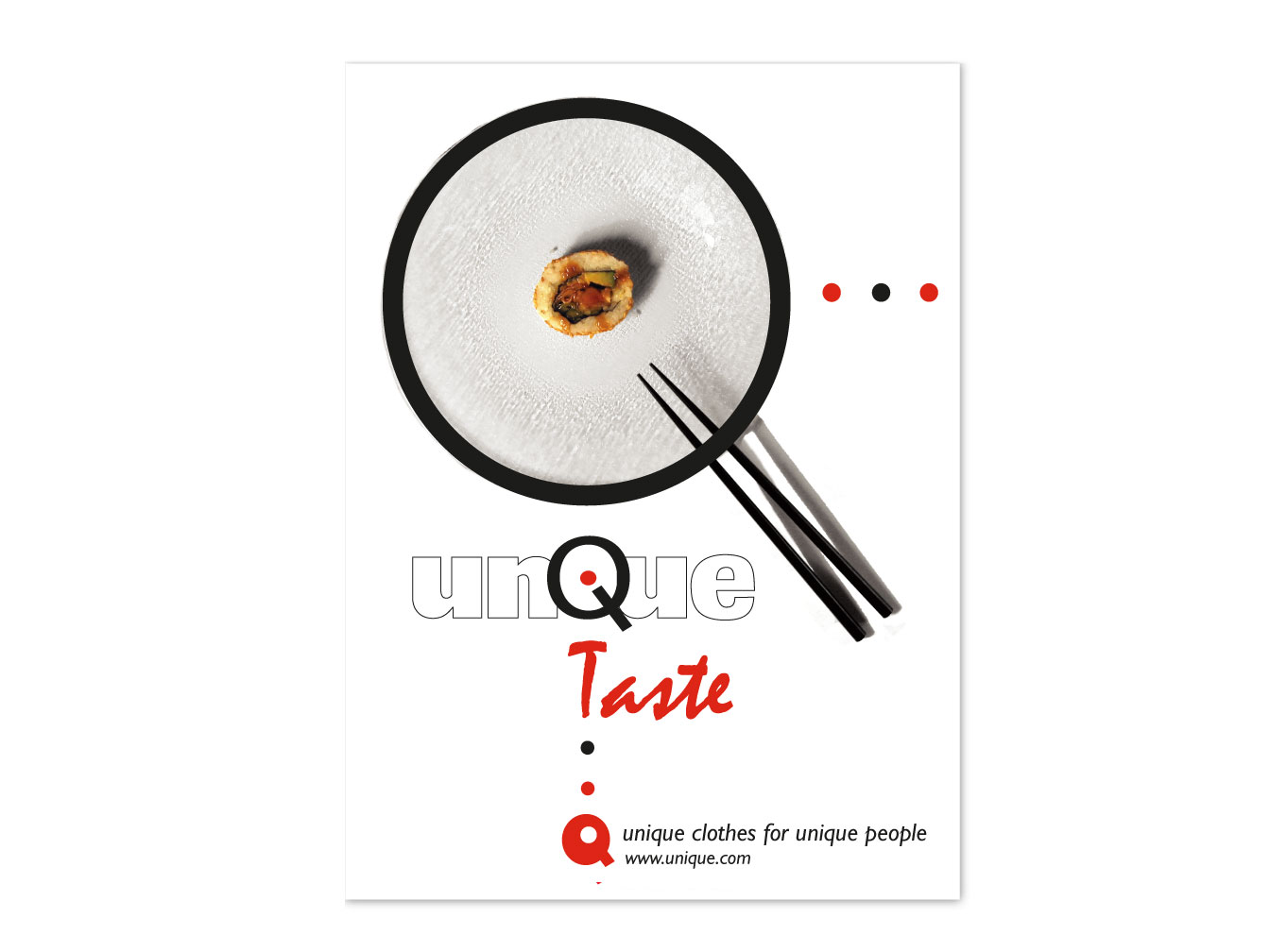
Magazine Ad Design
This ad features a plate of sushi creating the letter 'Q' for Unique Clothing Brands because sushi is a unique food option.
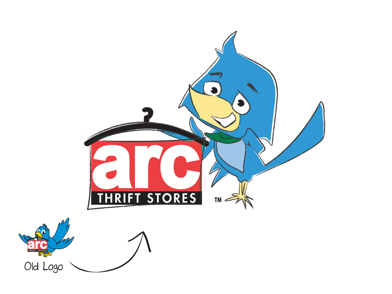
Illustrated Logo
Logo Rebranding
I contributed to the illustration and rebranding of the Arc Thrift Store blue bird to give him more character attributes and a bit of attitude.
Work done while at Avocet Communications
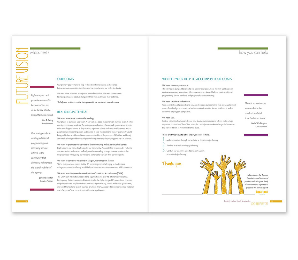
Annual Report Design
A page from an annual report. Custom annual report design available for your company.
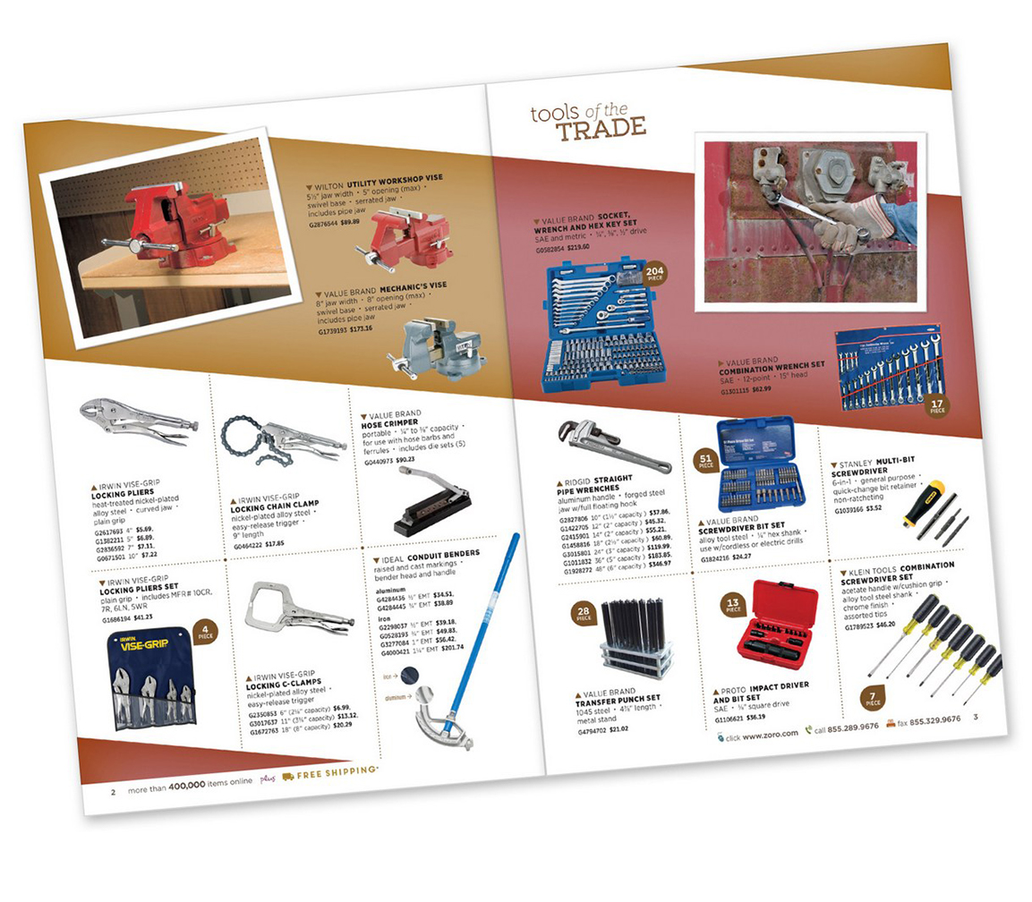
Catalog Page Design
A page from a product catalog. Custom catalog page design available for your company.
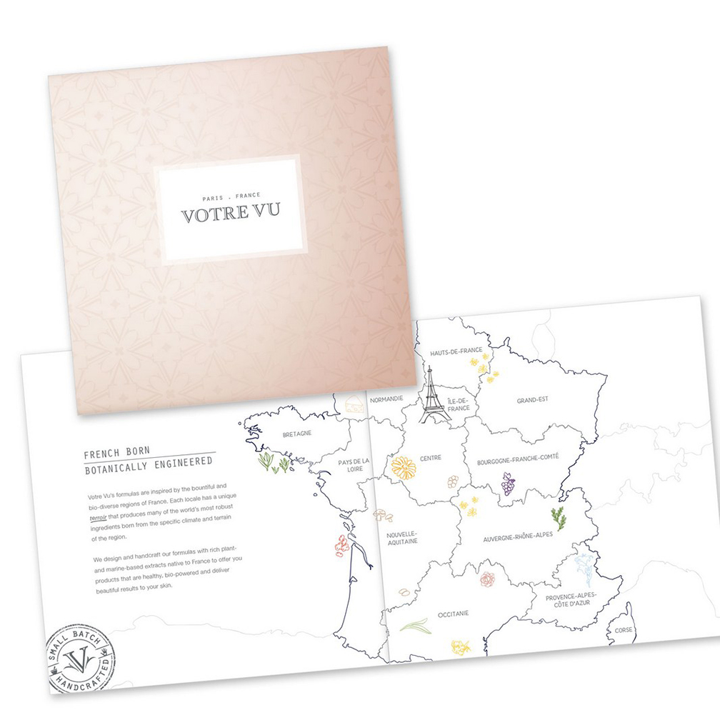
Mini Catalog Product Marketing
An example of cover and page layout for a mini product catalog. Custom catalog design available for your company.
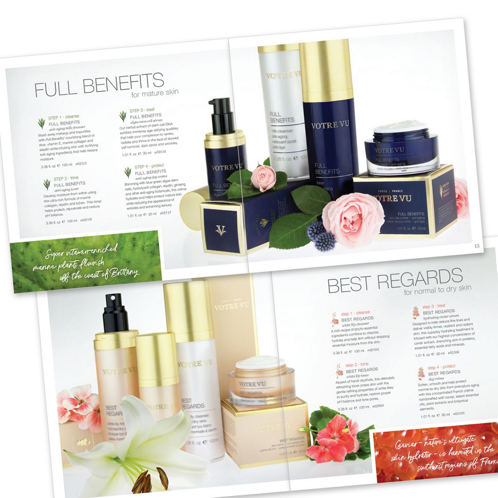
Annual Report Design
An example of page layout and design for a mini product catalog. Custom page design available for your company.